| February 15, 2011 continued.
Sentimentality in art: BLEH! I call
my blog ‘unvarnished’ because on occasion I feel the need to
honestly and frankly discuss critical but touchy issues in art that are
just cryin’ out for attention (hey, what have I got to lose?!)
Such is the case with the epidemic of sentimentality afflicting
a lot of current representational art, which if left unchecked
could cripple representational art’s tentative renaissance (if there
really is one) over the long term. Well...what is meant by ‘sentimentality?’ Granted, it’s hard to define what makes art sentimental, but as they say, I know art thus afflicted when I see it! It would be easier to describe the problem if I could link to some of the numerous, blatant examples. The point, however, is not to single out individual artists--which would be needlessly mean-spirited--but to raise awareness and provoke thought in general. The best discussion I’ve encountered is the following excerpt from Saddleback College’s Professor of Art Vito-Leonard Scarola’s Juror Statement: “Subject matter is often times an important or main part of the content of a painting…From my standpoint if too much emphasis is placed on subject matter alone, or one uses emotionally charged images only for the shock value or attention, or emphasis is placed on over sentimentality or beauty, or any other emotive or intellectual devises that draw attention to themselves, this will prevent one from seeing the true nature of the creative process and ultimately falls short from a qualitative standpoint.” Emotionally charged images. Emotive devises that draw attention to themselves. We’re getting very close here to the core of the problem. If it’s too sappy-gooey, too theatrically histrionic, too self-conscious, too staged and contrived, it’s TOO SENTIMENTAL. The antidote to sentimentality in art isn’t a cold lack of emotion, total detachment, it's honesty; honest feeling derived from genuine human experience. Rembrandt, for example, depicted the full range of human emotion, everything from quiet reflection to chaotic action and drama, yet never succumbed to sentimentality. Regardless of how technically well executed it may be, representational artwork marred by sentimentality is not getting called out on the carpet when it should be by those who ought to know better, and I suspect it’s getting a blind pass for several reasons: 1) The representational art gatekeepers, including some established artists, surprisingly may not understand why sentimentality is undesirable in art. If this is the case, it’s very troubling indeed. alternatively, 2) Representational art gatekeepers may be fully aware that sentimentality is a serious flaw in art, but avid and moneyed collectors are not being adequately advised regarding the lack of long term artistic significance of work plagued by cloying sentimentality. In short, it sells to the uninformed, and why mess with a profitable thing, right? If this is the case, it is clearly a problem, but the up side is that collectors can be educated about art, aesthetic consciousness can be raised, so ultimately it's a little less troubling. 3) The influence that Hollywood and television have had on aesthetics in the arts. Too many potentially good productions inevitably sell out in the end by pushing the easy, one-dimensional emotional buttons, and this may have had some impact on the other visual arts over time. and finally, 4) Part of it may very well be attributable to insecurity or uncertainty over the role of representational art in terms of future art historical significance, and nostalgia for an imagined glorious past; an understandable but misguided desire on the part of advocates of representational art to restore to representational art a perceived former grandeur and gravitas that fell out of favor with the inception of Modernist art. Well, that's the gist of it, for better or worse. Difficult things to approach, but when all is said and done, it makes for a more interesting and meaningful blog to talk about things in art that really matter. I’ll add to this topic as I review other writings about this issue later this evening… |
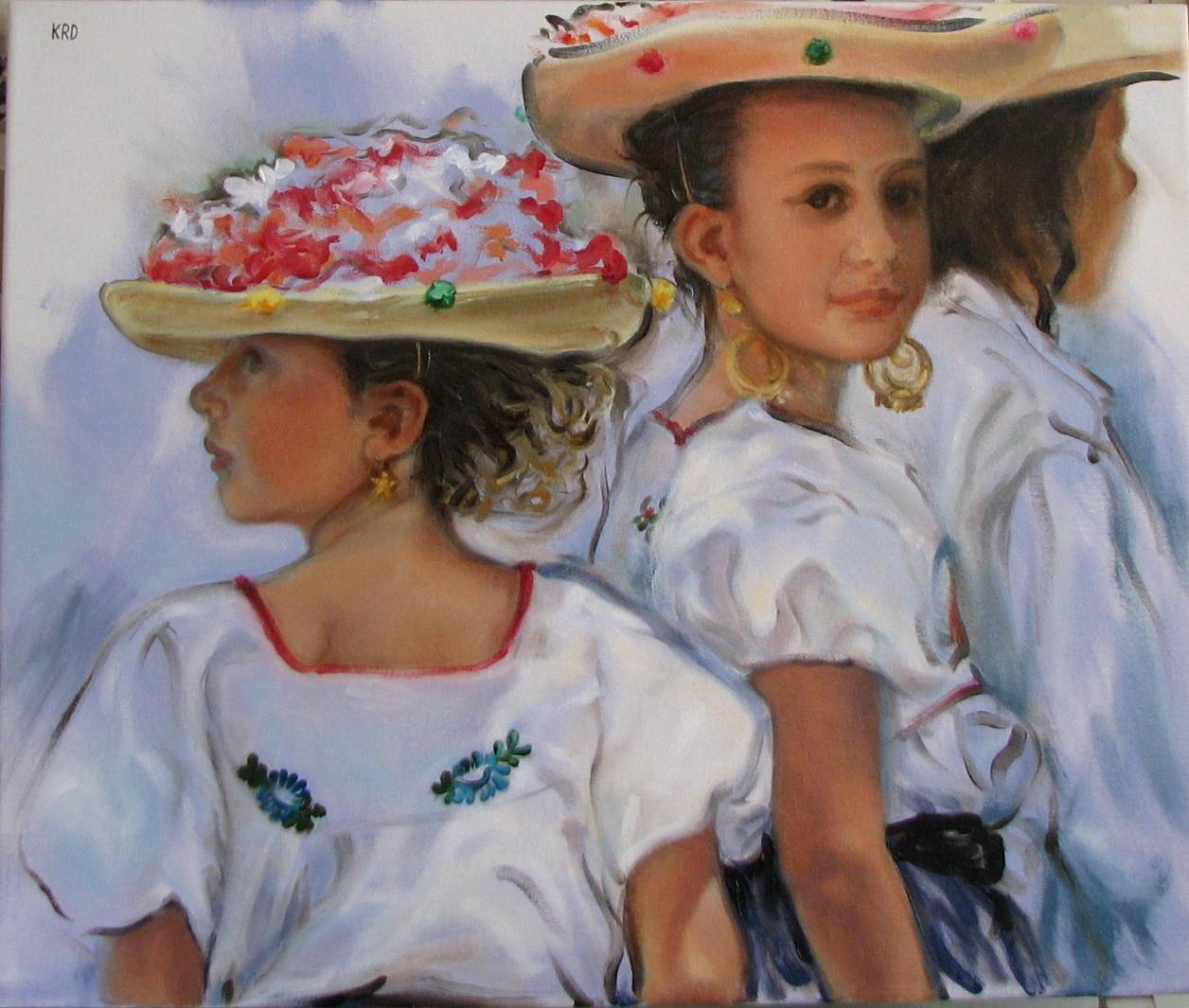
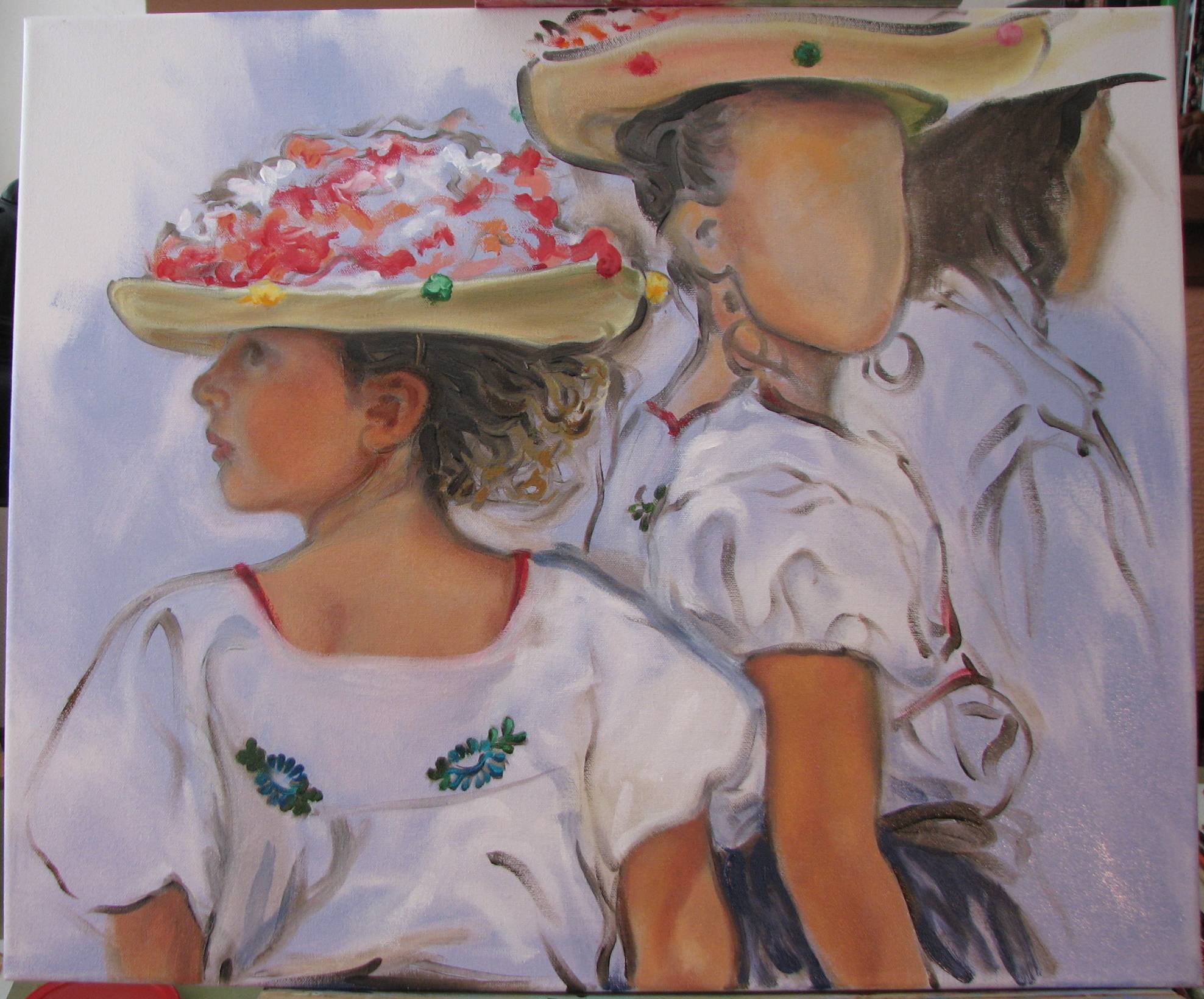
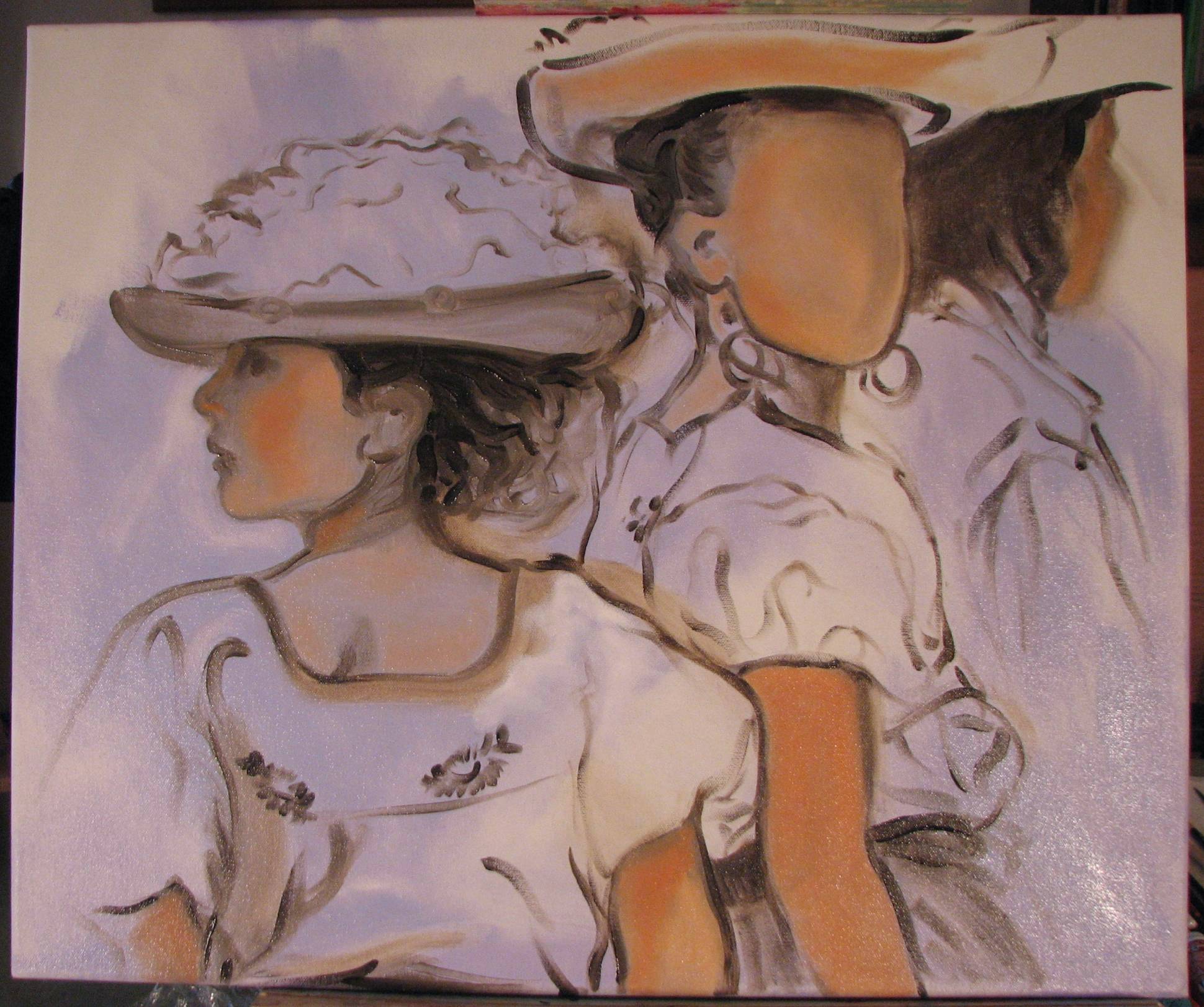
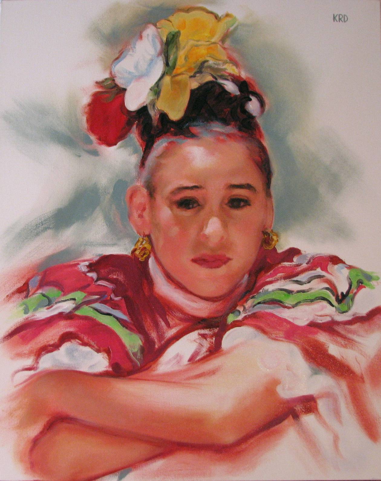
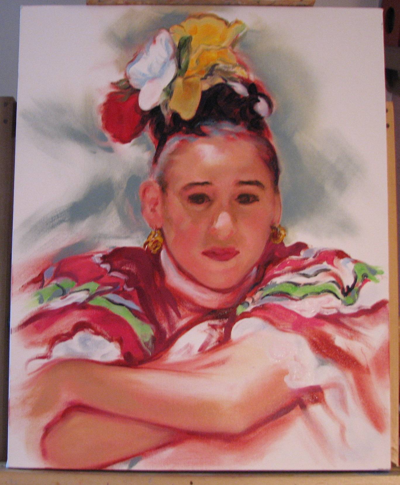
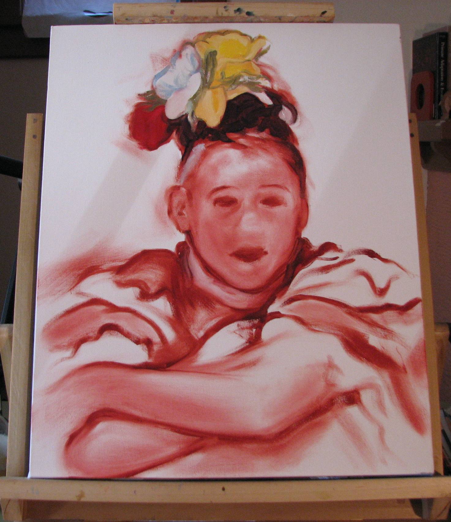
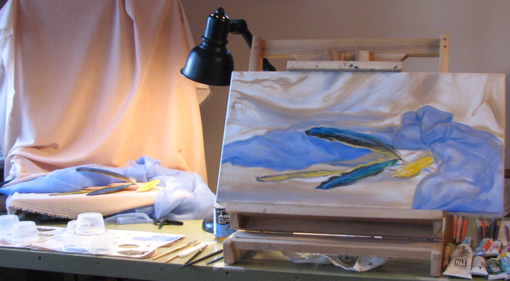
| February 15, 2011. 'Fiesta Hats'
completed. This painting was an
experiment in using dark paint to lay out the initial drawing,
and in some areas the dark brush lines are
still quite evident, such as in the contour lines of the middle
figure's hat. I also loosely toned large expanses of the
canvas with a lavender blue at the start, which is something I
hadn't tried before. The figures are united as a group not only by their close position and their fiesta attire, but by the streak of dappled sunlight that falls across their shoulders. The big lesson in this painting involved handling a range of light and shadow without overdoing either extreme. I spent a lot of time stepping back and looking hard at the transition between the sun streaked and spotted areas and the cooler shadows. There were so many 'land mines' in this composition where I could have over drawn and overpainted the facial features, got too carried away with the bright colors, and lost the variation in edges, emphasis and focus. Equally challenging was conveying naturalism in the postures. The girl on the left has an air of an alertness, a little tension, which contrasts with the more markedly relaxed attitude of the older girl in the middle. To sum it up, there was a lot of juggling to be done in this painting, and as always, I learned a lot from the process. |
 |
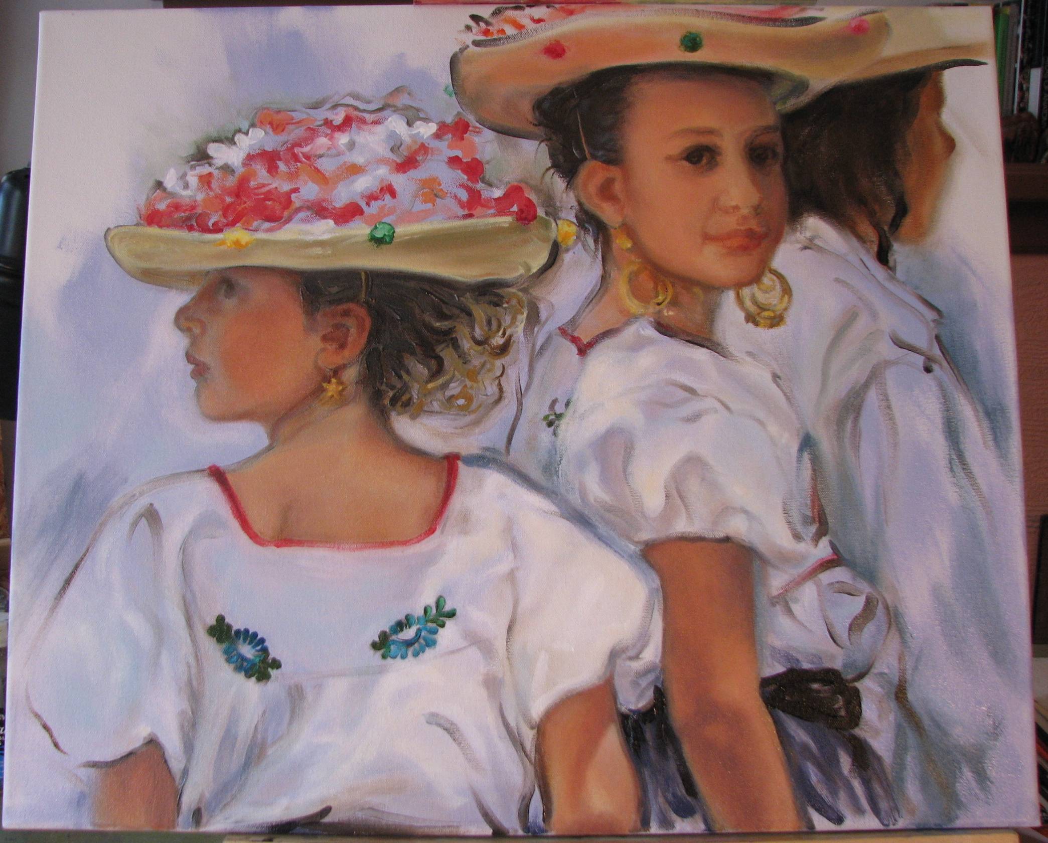
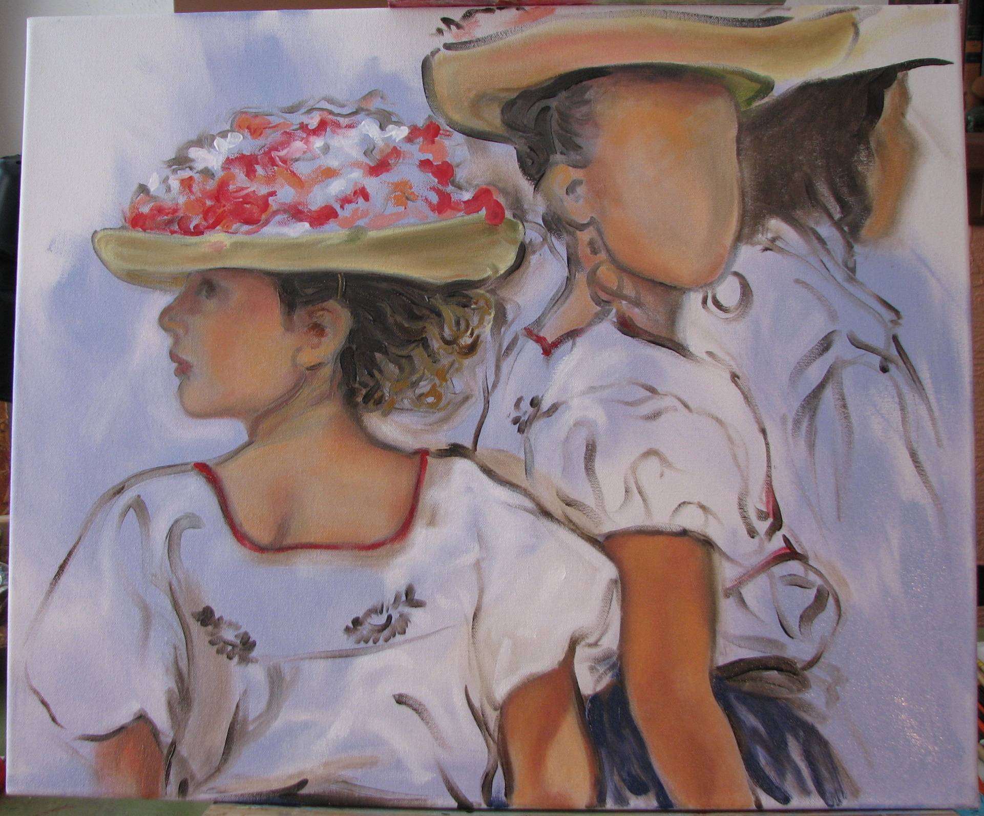
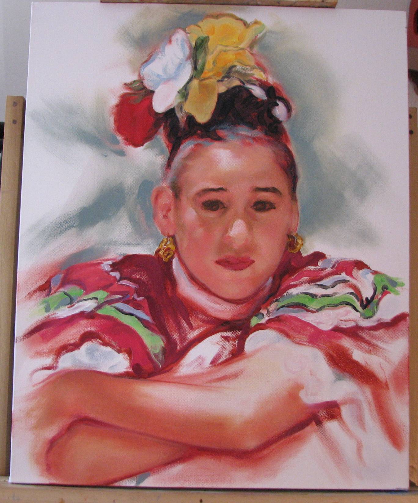
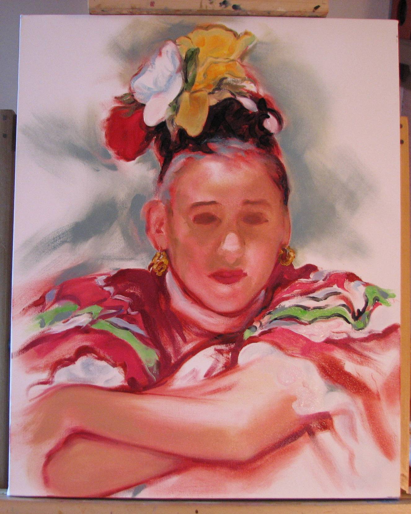
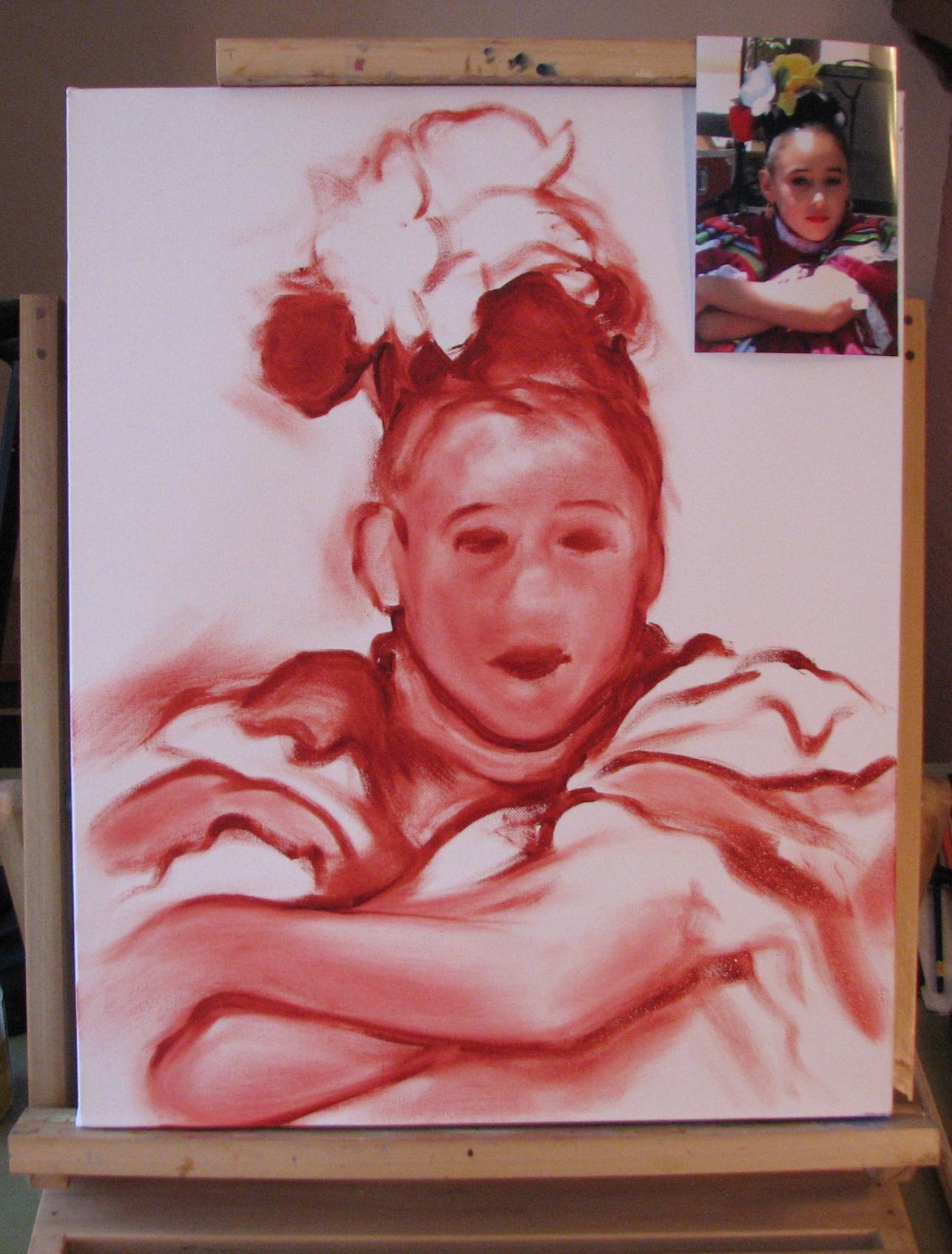
| February 12, 2011. Yes, I know...I said I was going to start a new page soon, but the weather and other difficulties threw a monkey wrench into my schedule. I have just a little more to do on this painting, so I guess I'll start the new page right after this painting is done. I'm finishing up on the middle girl's face, which wants to command a little more attention than I had originally planned so I guess I'll just go with it. I want to do a bit more finishing on the ears of both girls, and a little more work on the middle girl's features, within reason. Her left eye (the side in shadow) is a tad squirrelly looking, so I need to deal with that. The final task will be to assess overall cohesiveness, organization and balance by taking the whole thing in from a distance to see if there are any areas that need some adjustments, whether in the figures or the background tones. |
 |
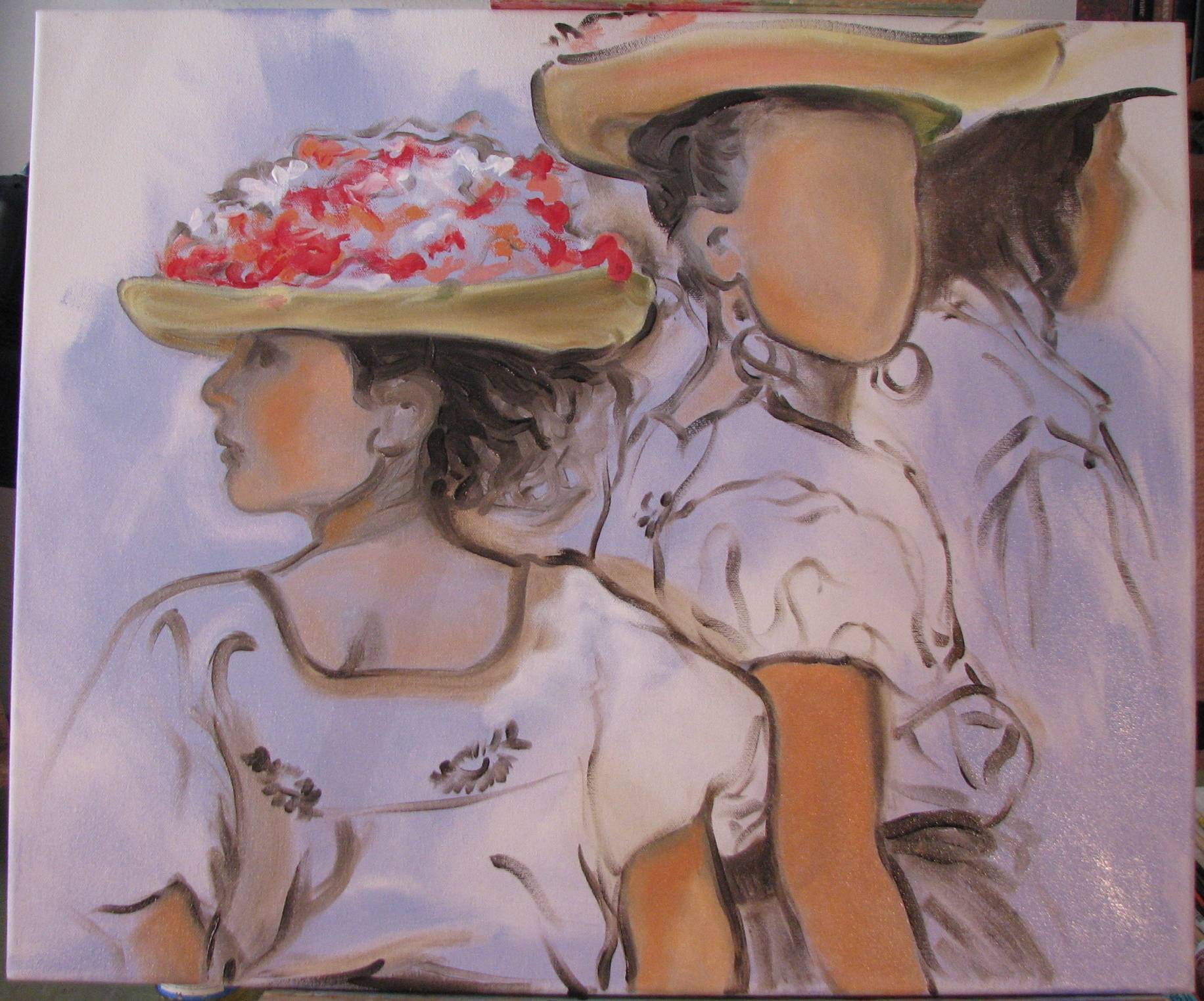
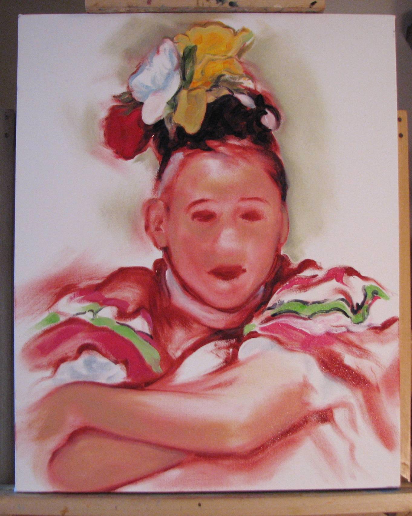
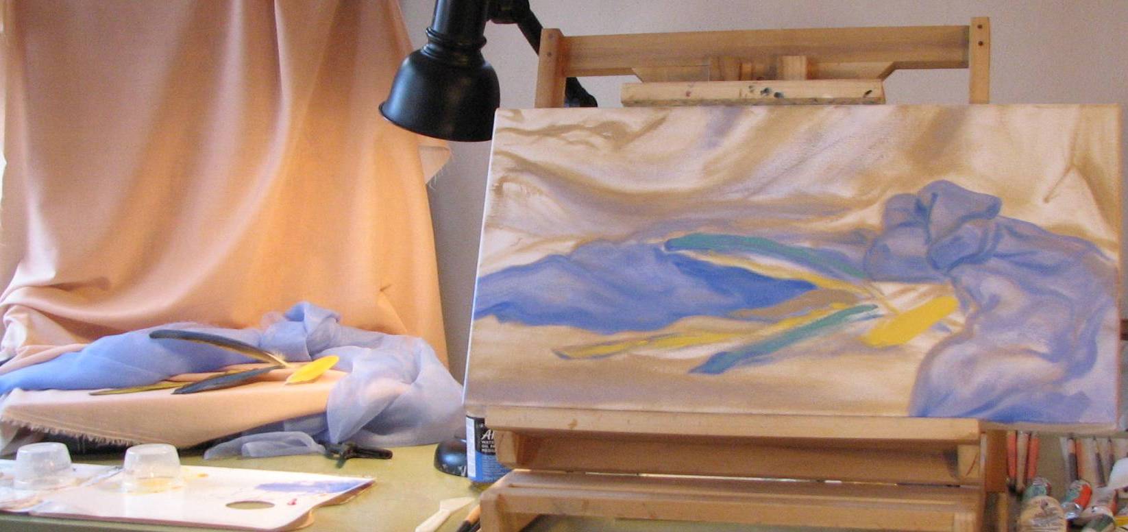
| February 8, 2011. Takin' the plunge.
I took a deep breath and started work on
the remaining faces. Again, values and color need to be
well thought out, as the secondary figures are in shadow, but
even so, it can't be too oppressively dark. The middle
girl is coming along well. I am always pleased when there
is a definite cohesiveness emerging in the features at this
early stage, signally that I've got the fundamental structure of
the head well established. I used an old 1/4" (7 mm)
filbert that's a little on the dog-eared side to lay in the broad
facial features, keeping me from getting distracted by
detail at this point. The brush probably needs to be
replaced, but it's got the right amount of spring, and the wear
on it actually makes it good for some things where I want a
little blurring. I keep trimming the frays off, hoping not
to have to throw out a versatile, favorite brush. I'm going to try and start a fresh blog page soon because this one is getting too long. I'll archive what I've got below. Some people archive by the month, but I hate to break up a particular topic, such as the painting I'm working on now, when it crosses over from the end of one month into the beginning of the next. At any rate, I'll be taking care of the new page soon. |
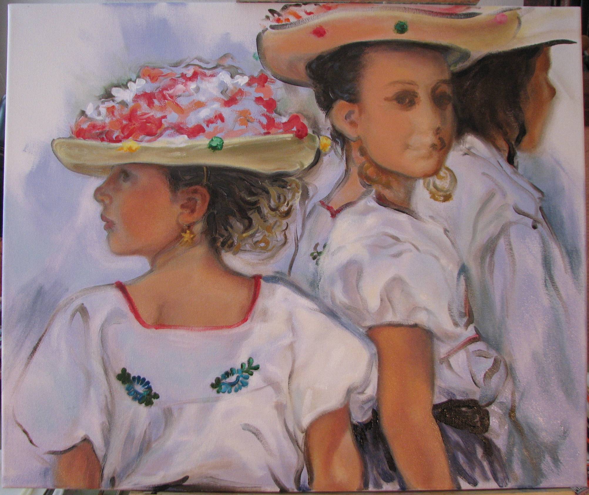 |
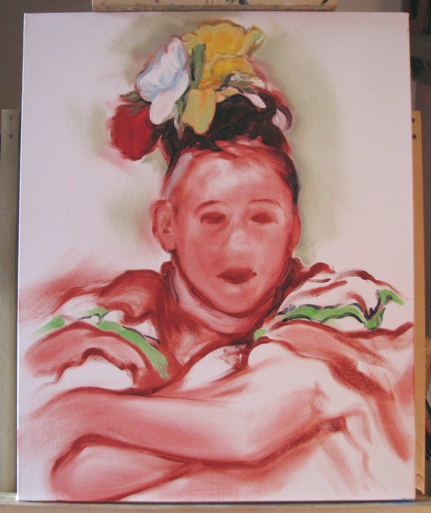
| February 7, 2011. Secondary figures
and background. The primary figure
is just about done. I had to lower the rear edge of her
hat brim because something was throwing her orientation off,
making her look at times as if she was facing forward rather than
being viewed from the rear. Lowering the brim slightly, and a
few other tweaks, seemed to stabilize her. Finally, I added her
earring and a trace of soft green at the edges of the flowers in her hat,
which may yet need to be lowered in value just a pinch. I moved on to the background and secondary figures, adding some darker values and some color changes in the blue areas here and there. The white blouses looked a bit cold and flat and needed some warmth in the highlights, so I mixed white with a touch of Naples yellow and a hint of flesh color and went back into the brightly lit areas of the blouses with the warmer white. The next main task is to begin work on the face of the girl in the middle without going into so much focus and detail that she pulls too much attention off the primary figure. Gotta think about this carefully. I shot this photo after 12 noon when the light is much more direct coming through my studio windows, so I'm getting a lot of flecks of glare on the canvas weave that I don't usually get in these photos. |
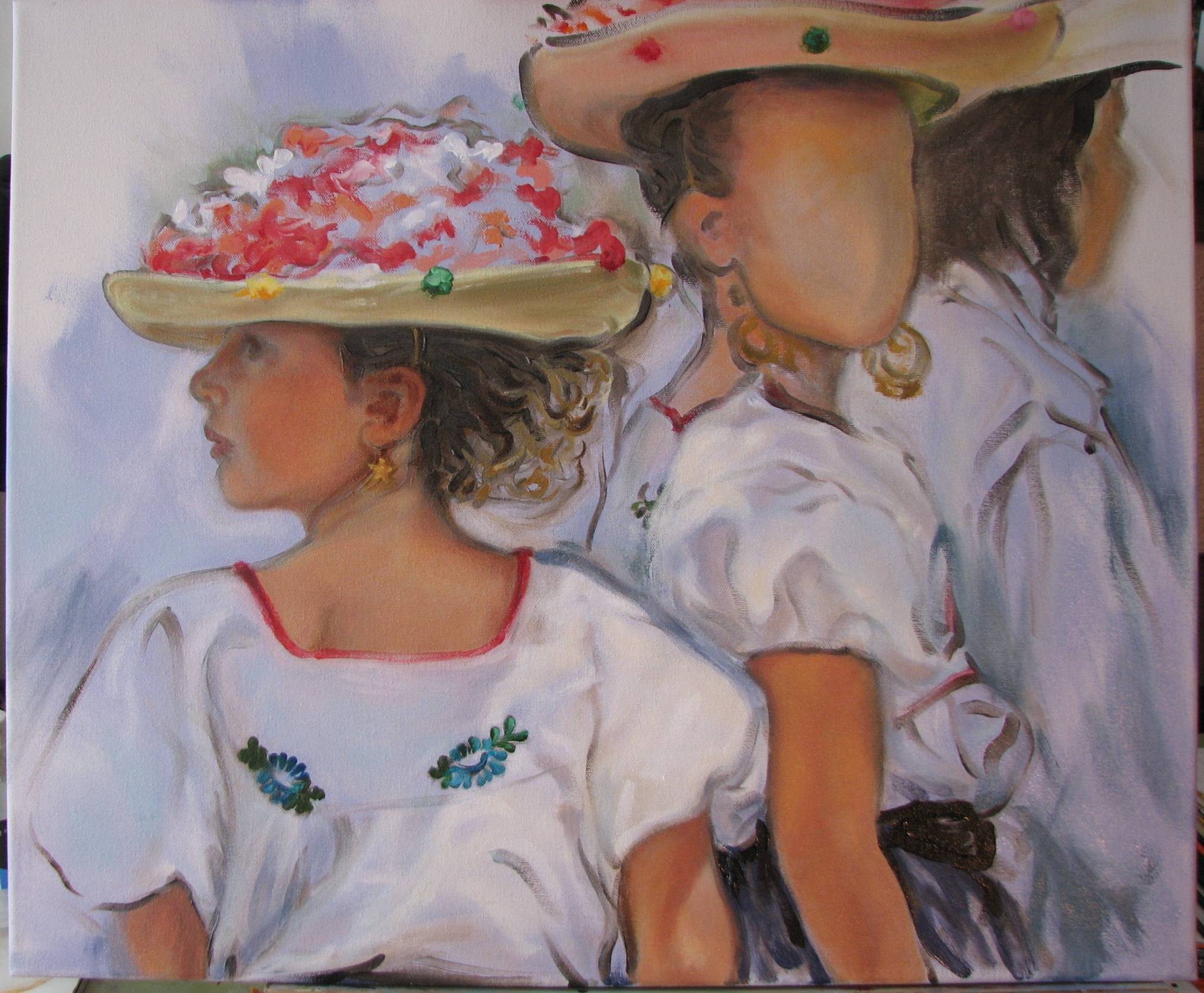 |
| February 4, 2011. Cold studio!
Like most of the U.S., we've been
experiencing a prolonged surge of snow and brutally frigid
temperatures for the past few days, and all the hardships that
brings to just managing the chores of daily life, not to mention
working conditions in my studio. I can get the temperature
in my studio up to a functional level if I keep a constant,
robust fire going in the fireplace. I've been detailing the hats, the blouses, and making some adjustments here and there on the gesture and posture of the primary figure. I had to raise the neckline of her blouse and straighten the torso. The torsion in her upper body is a difficult posture to describe convincingly, so extra care is required. Her head and neck are at just about maximum rotation to the left--a position that can't be held for very long--so the depiction has to give the impression of a fleeting, momentary turn of the head in response to something off to the left, out of the frame. I've got some tweaking to do before I'm satisfied that I've nailed it. |
 |
| February 2, 2011. Skin tones, skin
tones, skin tones. The challenge to
this particular composition is in the variation on shadow and
light all throughout the painting, and how this affects the
flesh tones. A small bit of the arm is in bright sunlight,
other areas are in greater shadow, and the rest ranges somewhere
in the middle. I don't want to inadvertently exaggerate
the extremes of either light or color and value. The face of the primary figure is in shadow, but that shadow transitions from deepest under the brim of the hat to relative brightness around her chin and shoulders. In other words, it's a complex area and it is important to calibrate the light, color and values carefully on her face. The other figures won't be developed as much as this one, although they'll still need some attention. Once I get the primary figure where it needs to be in terms of light, color and value I can then adjust the other two figures. |
 |
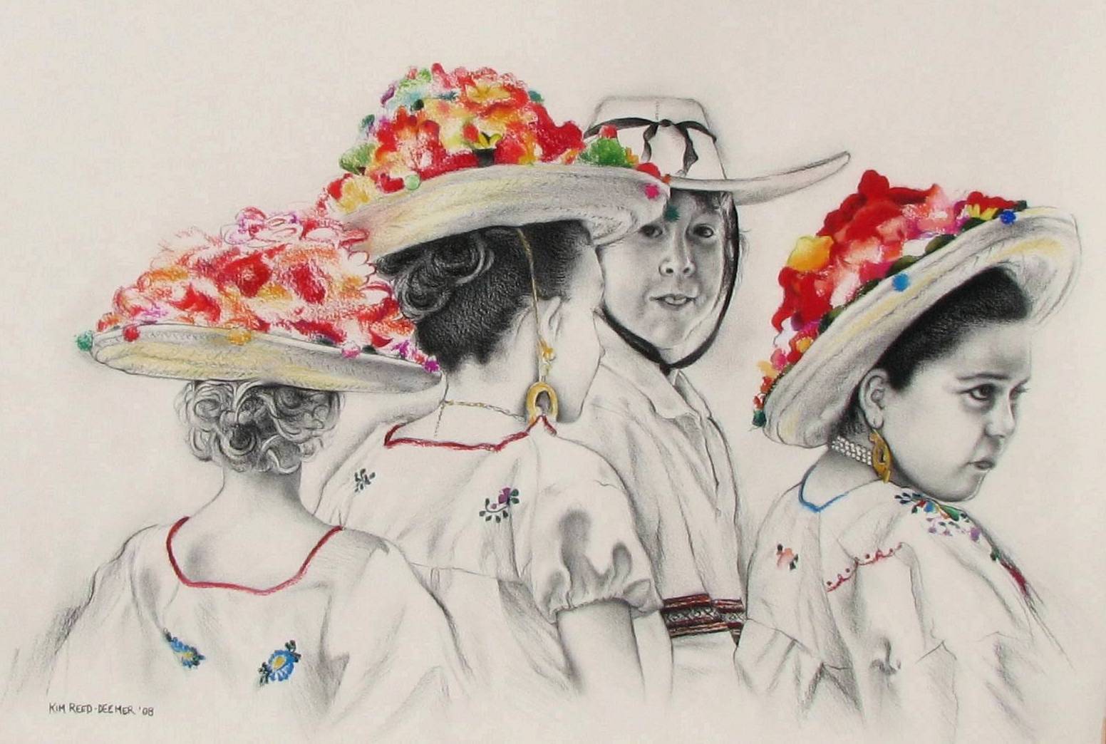
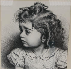
| February 1, 2011. That's some hat.
I began work on the hats last night, first
laying in the local straw yellow color of the brims, and then
working on reflected light and shadows. These hats are
piled high with colorful artificial flowers. I recalled
from a previous charcoal and pastel drawing I did a couple years
ago of this same group that the less I actually fussed with the
flowers, the better. In that drawing there were three of
these hats with flowers, and by the time I got to the third hat
I had figured out not to overdraw the flowers, to handle them
with an easier, lighter, more suggestive touch. I likely will not add a whole lot more to the flowers below. The greatest development in the flowers is clustered right above her profile, which is where the focus should be. For comparison, below this photo is the charcoal and pastel drawing of this subject that I did two years ago. |
 |
 |
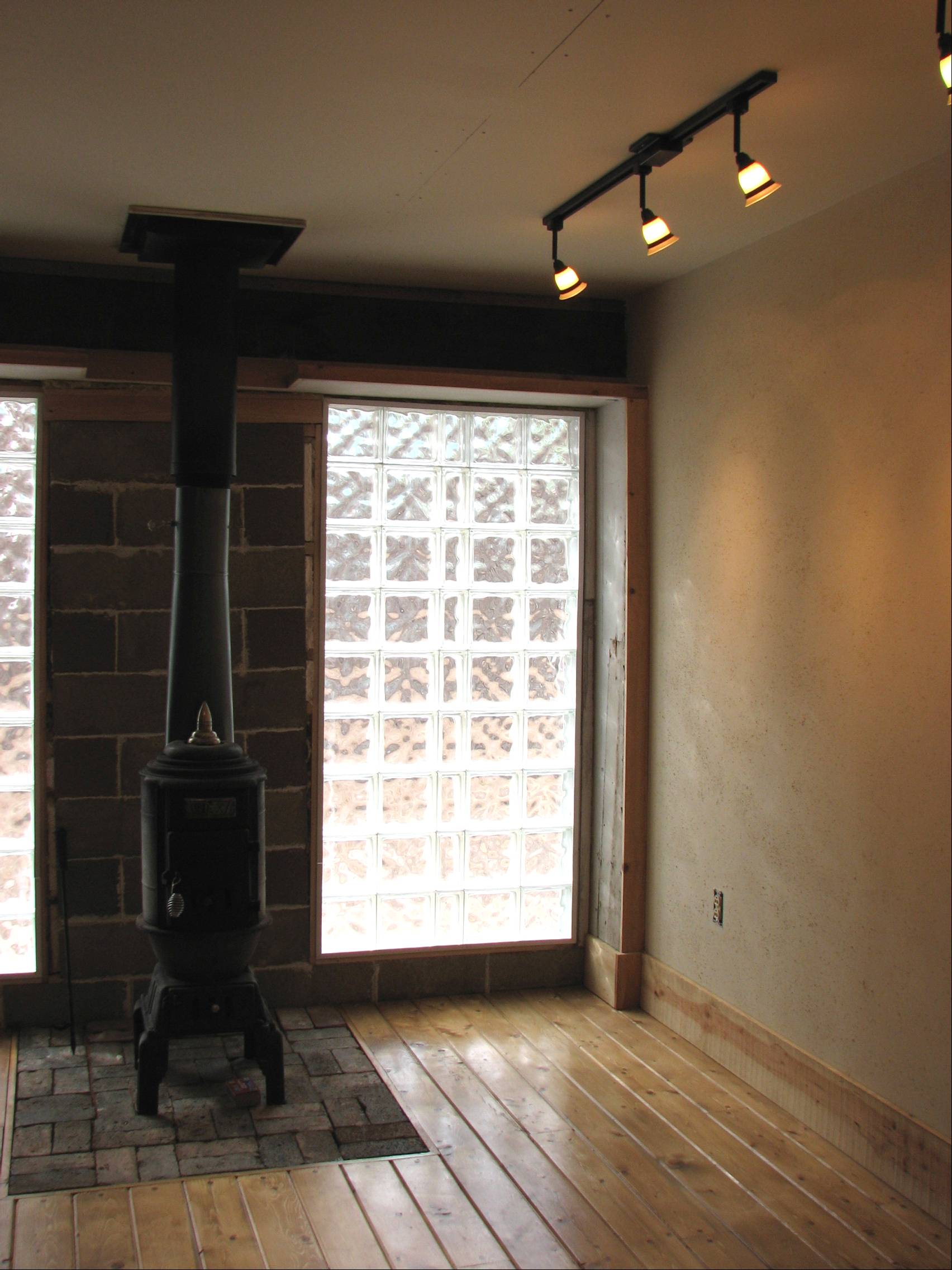
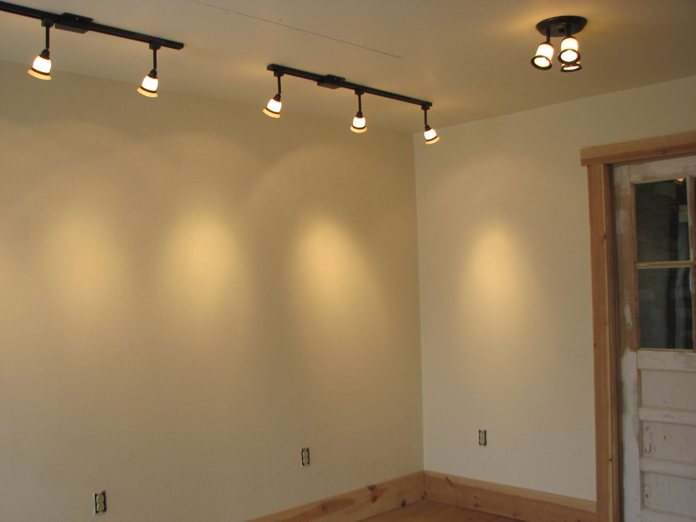
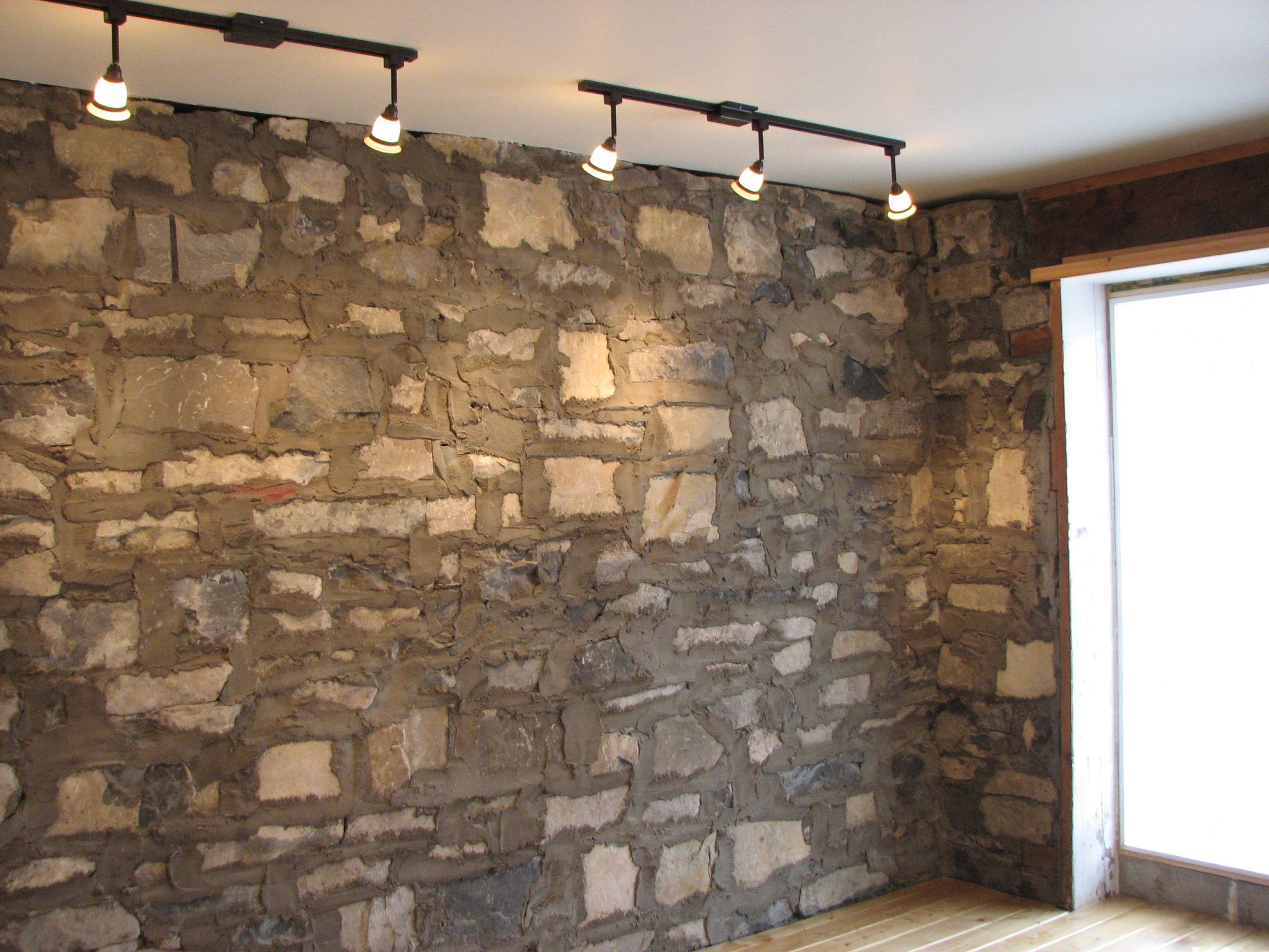
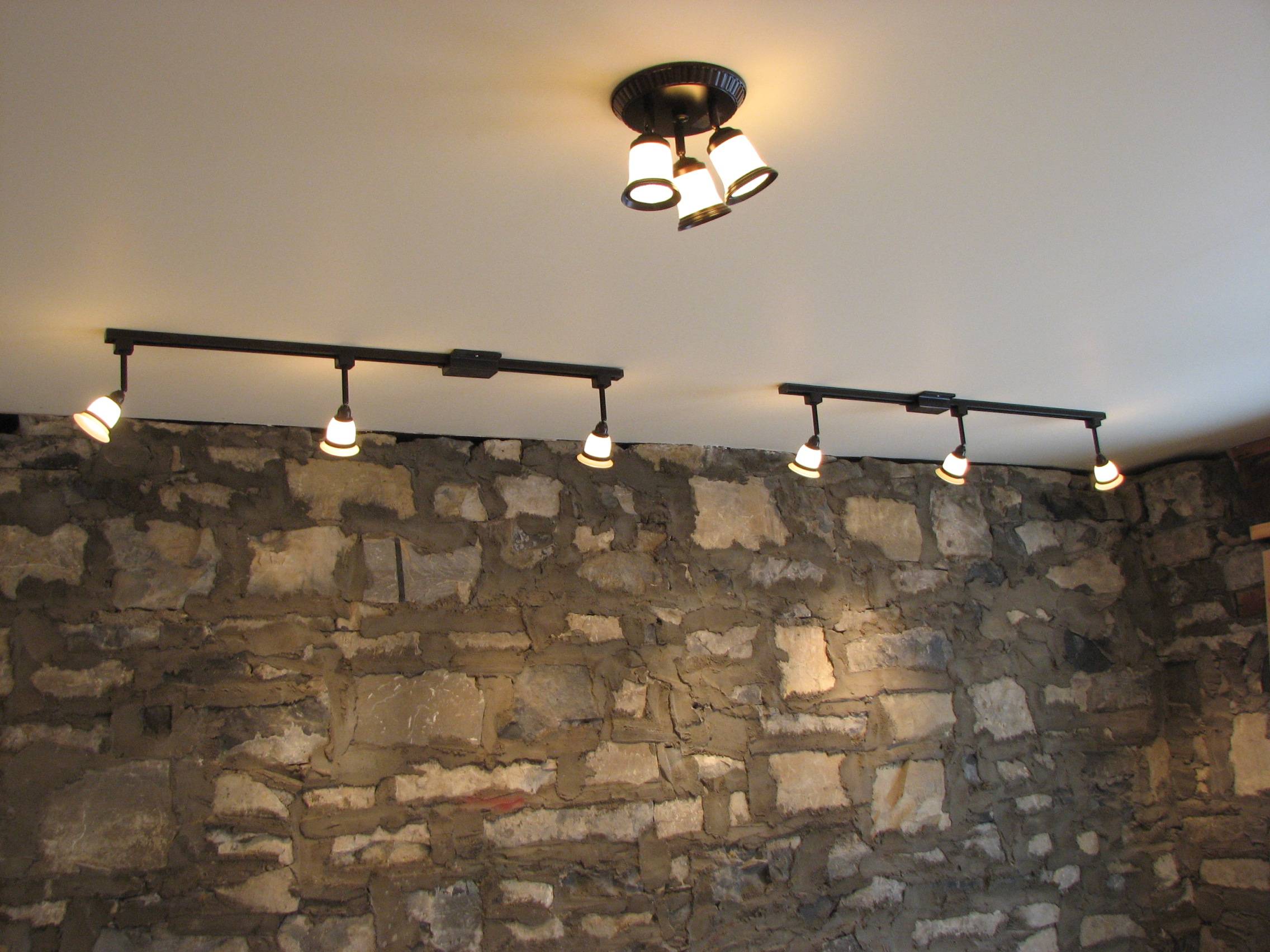
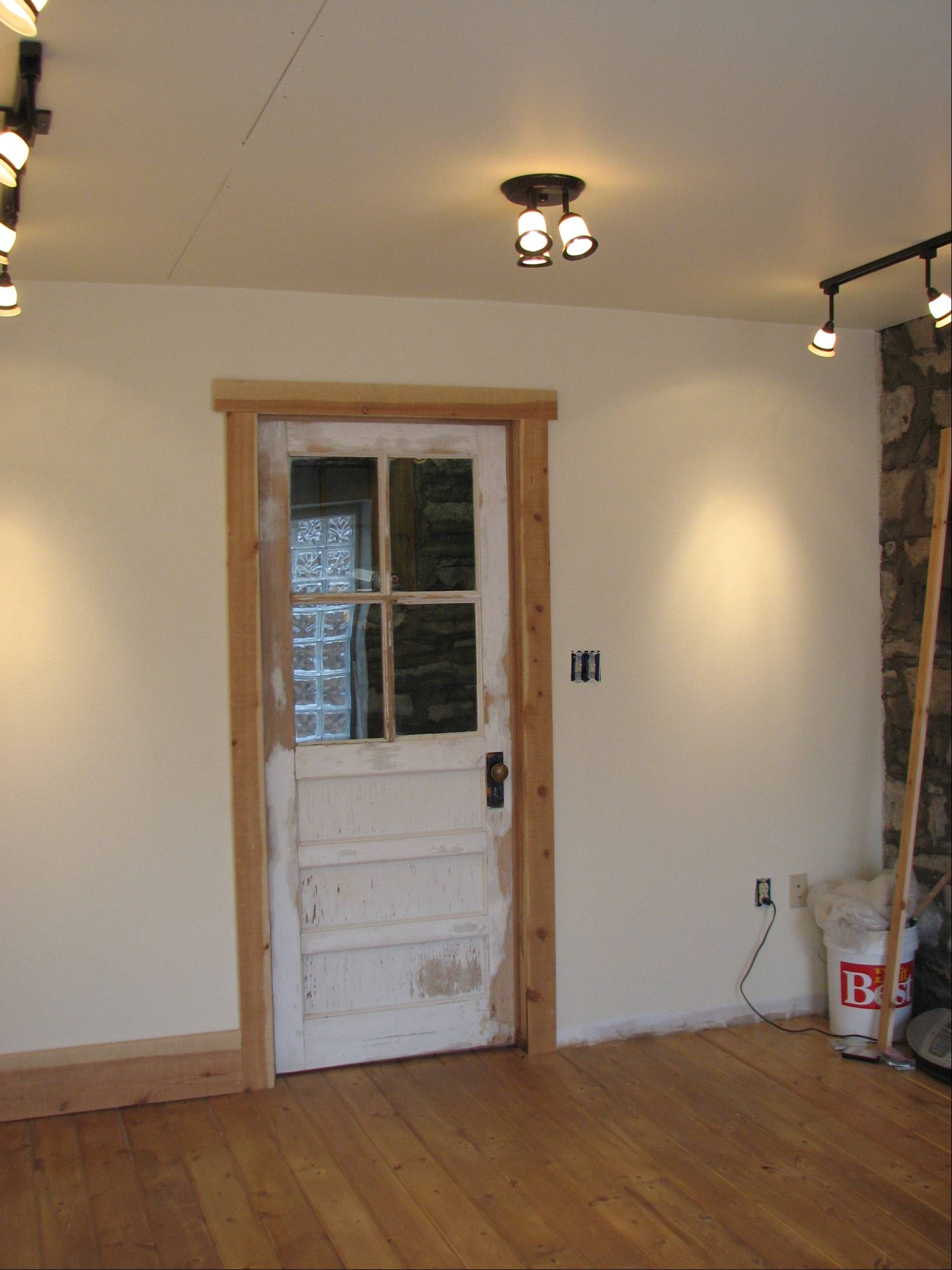
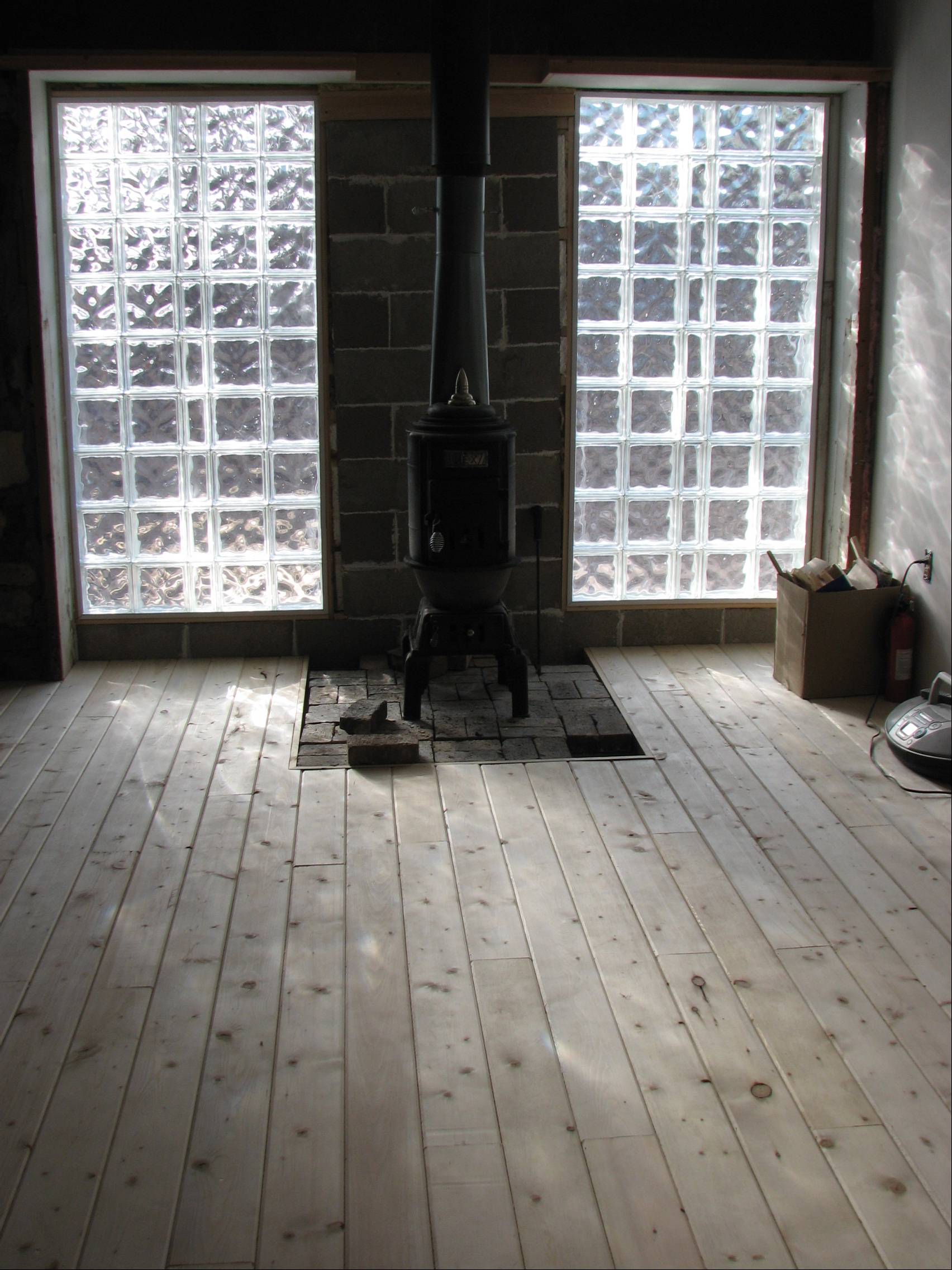
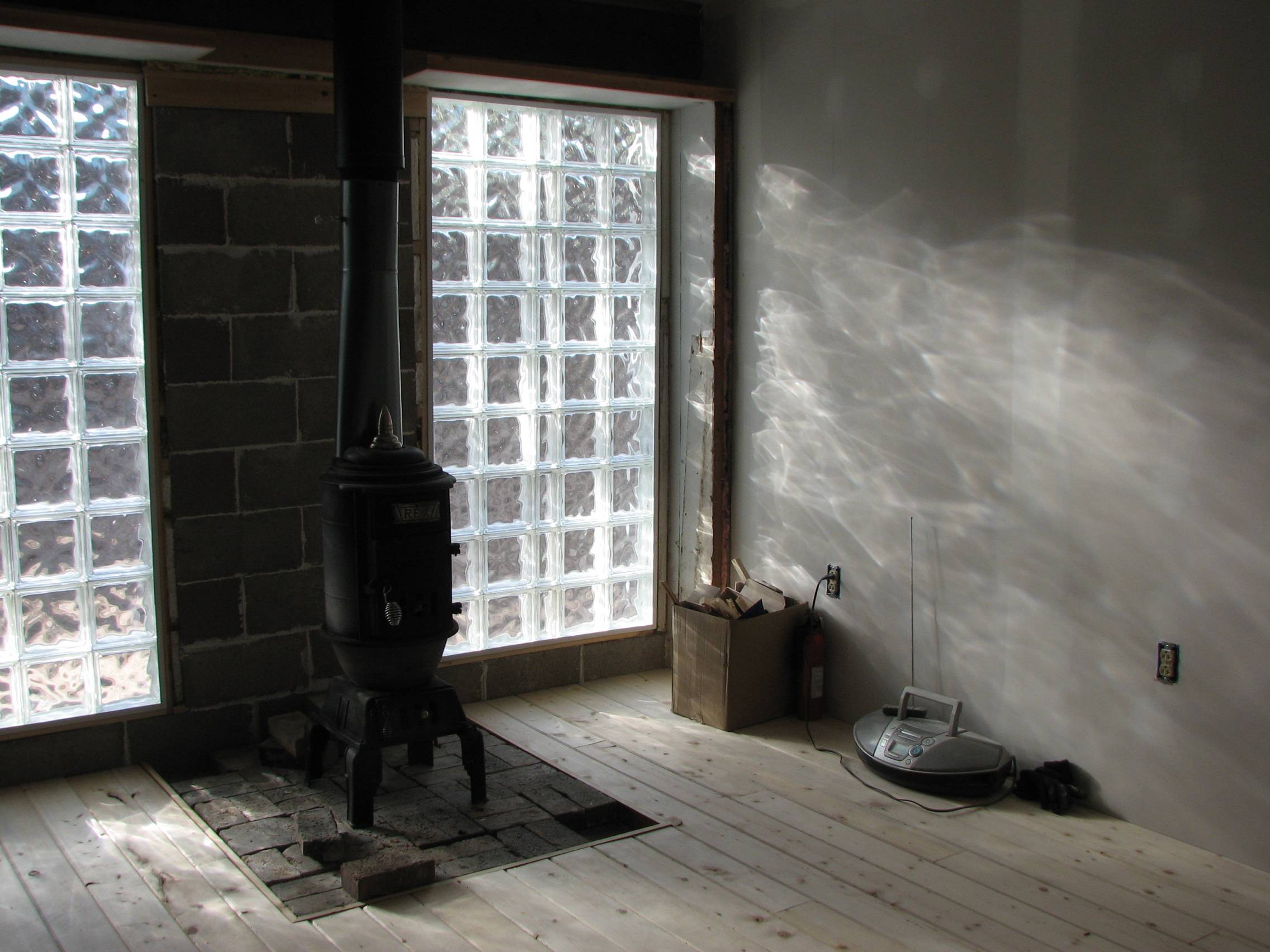
| January 31, 2011. Show room nearly done. The spotlights are in, and we still have to tile between the glass block windows, finish a little bit of trim around the blocks, install some narrow, cosmetic-only (i.e., non-structural) ceiling 'beams,' paint the door, and install the picture hanging system. (OK, so there's still a lot to be done, but it's essentially finished). We did it all ourselves and $aved a bundle : ) : ) : ) I can't wait to make the 'big transition' into the showroom and start rearranging my cramped studio... |
 |
 |
 |
 |
 |
| January 31, 2011. Blocking flesh tones. After being satisfied that the drawing was correct, I started blocking in some of the higher chroma flesh tones. I was a little unsure how the lavender would fare showing through some areas of the skin, but to my surprise it seems to work just fine. Right now the flesh looks a little strident with just the bright peachy color against the lavender, but there will be much greater development involving more varied and subdued skin tones, ranging from pale, highlighted areas to more deeply shadowed regions. |
 |
| January 30, 2011. A drawing or a
painting? I was looking at my Degas
books for insight (yet again) and was reminded of an unusual and
characteristic thing about his paintings and drawings: visible
black contour lines. It looks as if he consistently drew or
painted his initial layout in either charcoal or black paint.
He then modeled figures and blocked in color and values to build
up the forms, etc., but these basic structual or contour lines
were always prominent, and in some instances it appears he even
went back into areas where the lines had been obliterated or
muffled and restated the fundamental black lines of the figure
or object. And then left them to be seen. The overall effect
is that it is hard to claim that his paintings were strictly paintings
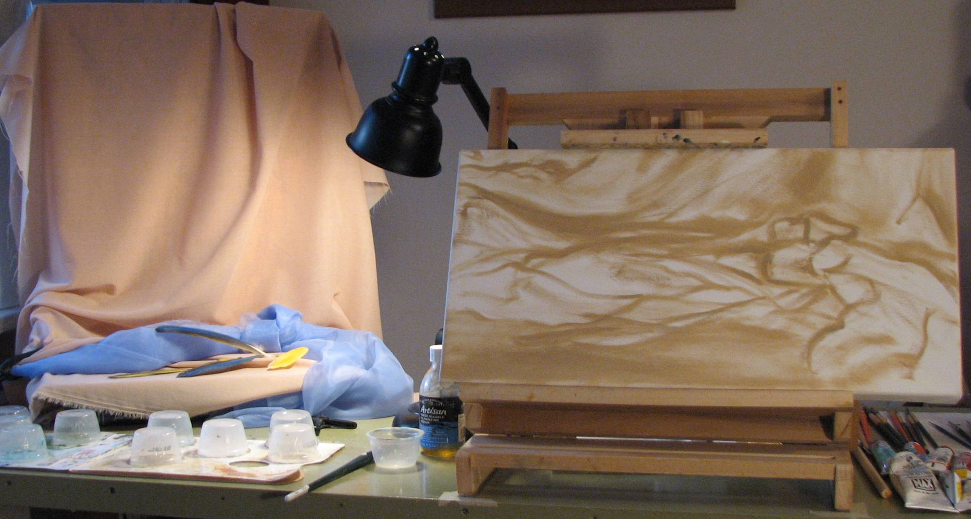
because the drawing is so dominant. I started a new multiple figure oil painting and decided to try a few new things. I toned much of the canvas with a lavender blue, leaving patches of bare white canvas in areas which will be within streaks of bright sunlight. Then I began drawing in the figures with medium brown paint, which is different from my usual approach using a layout or initial sketching color that is anything but brown or black. I have to say I was a little hesitant to use such a dark color, so I lightened the brown with a smidge of white, but eventually I saw that I really needed to go darker so I mixed Payne's gray with the umber--without any white-- and went back into it. Because the lavender is still wet, the dark lines tend to mix with the lavender and lighten as I draw (painting wet into wet), so my lines are still not as dark as they could be. I suppose in order to get really dark lines I'd have to wait until the lavender dries and then do my drawing with the dark paint. I've been focusing on getting the basic drawing correct before I do anything more to it. This is the fun but kind of jittery stage because of the raw roughness to all of it. But that's a good thing; rough and raw is just fine at this point. A rough painting can be developed further, but it's very hard, almost impossible, to backpedal an overworked painting back to freshness. The figure of the younger girl on the left is obviously the focal figure, and most of my attention will be devoted to her...and her totally bodacious hat. |
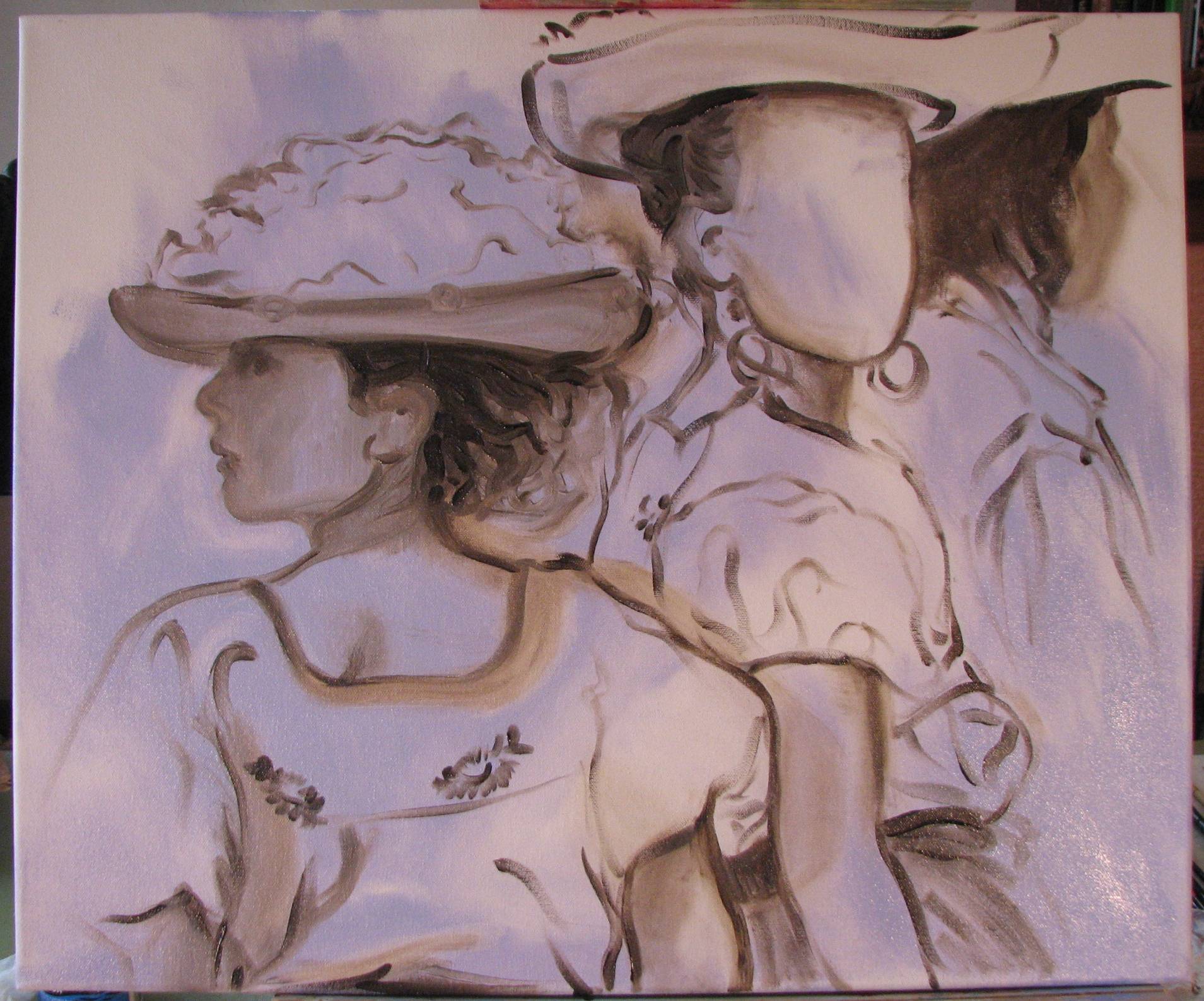 |
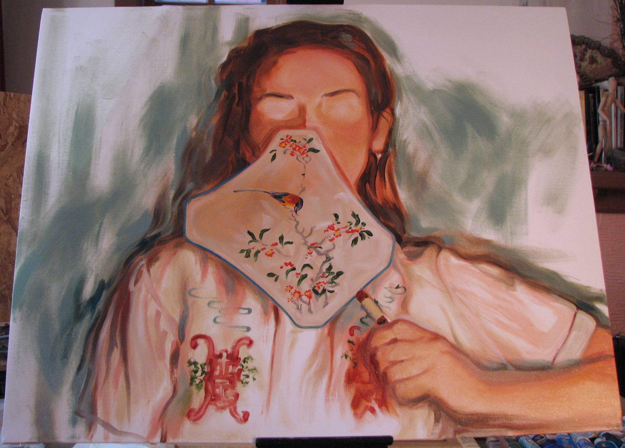
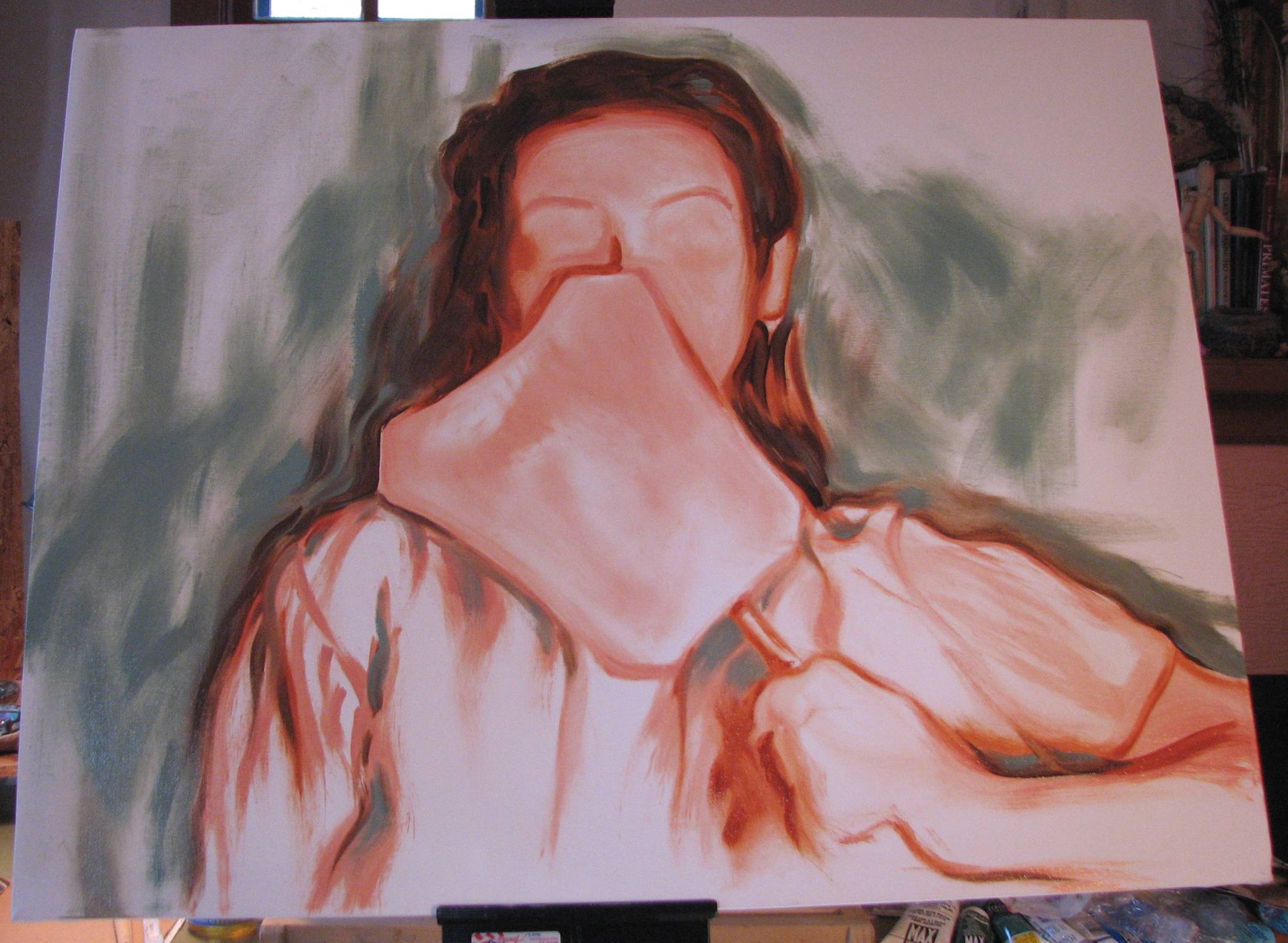
| January 29, 2011. My second oil
portrait done! It's not often that
paintings or drawings turn out as we might initially imagine
them, they sometimes have a will of their own and take a turn in
a different direction, but I have to say that in this case the
portrait of my sister does come very close to what I was after
in my mind's eye. The primary objectives were to convey
her personality even though much of the usual visual information
of her face was obscured, and to paint the portrait in a manner
that was decisive and fluid. What did I learn from the process? 1) Placement: in the rush of energy to start a new painting, I need to slow down a bit and make sure I've fully considered the total placement of the image on the canvas. The fact that I didn't place the subject exactly where I would have liked didn't ruin the painting, but it did mean that I had to work a little harder than I otherwise might have to balance the elements compositionally using the background toning, emphasis of line, and values. 2) Flesh tones: I experienced some strange and unexpected color shifting in the flesh tones, and I wonder if I need to tone the canvas more before I do my preliminary monochrome layout. That might provide a more uniform undertone to the flesh areas, and then I can vary the skin tones as needed. I've been doing my initial layout on a mostly white ground, and I think I'm going to give the next one more of a colored ground instead of the white. 3) It's very difficult to paint on an easel that isn't stable! I bought an aluminum floor easel so that I could use much bigger canvases like the one I used for my sister's portrait, but in spite of the manufacturer's claims to the contrary, there was a definite bounce to it that made it harder to use. The wooden table easel my husband made for me is as solid as a rock, and eventually he'll make me a wooden floor easel, but for now I have to deal with the flapping easel if I want to paint large canvases. Now I have to email this image to my sister... |
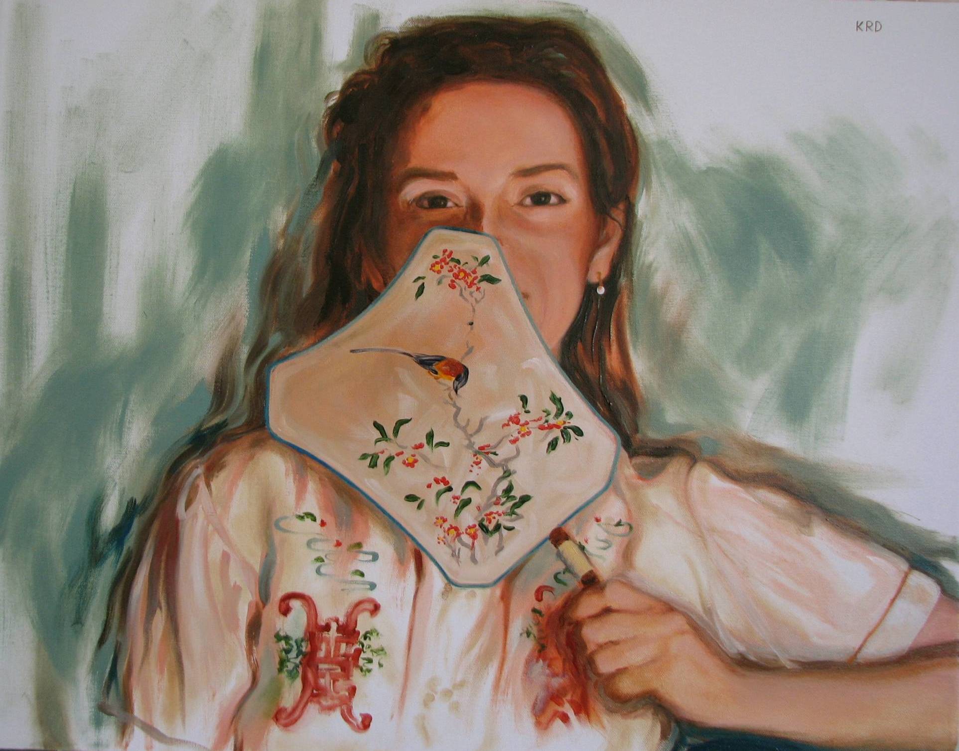 |
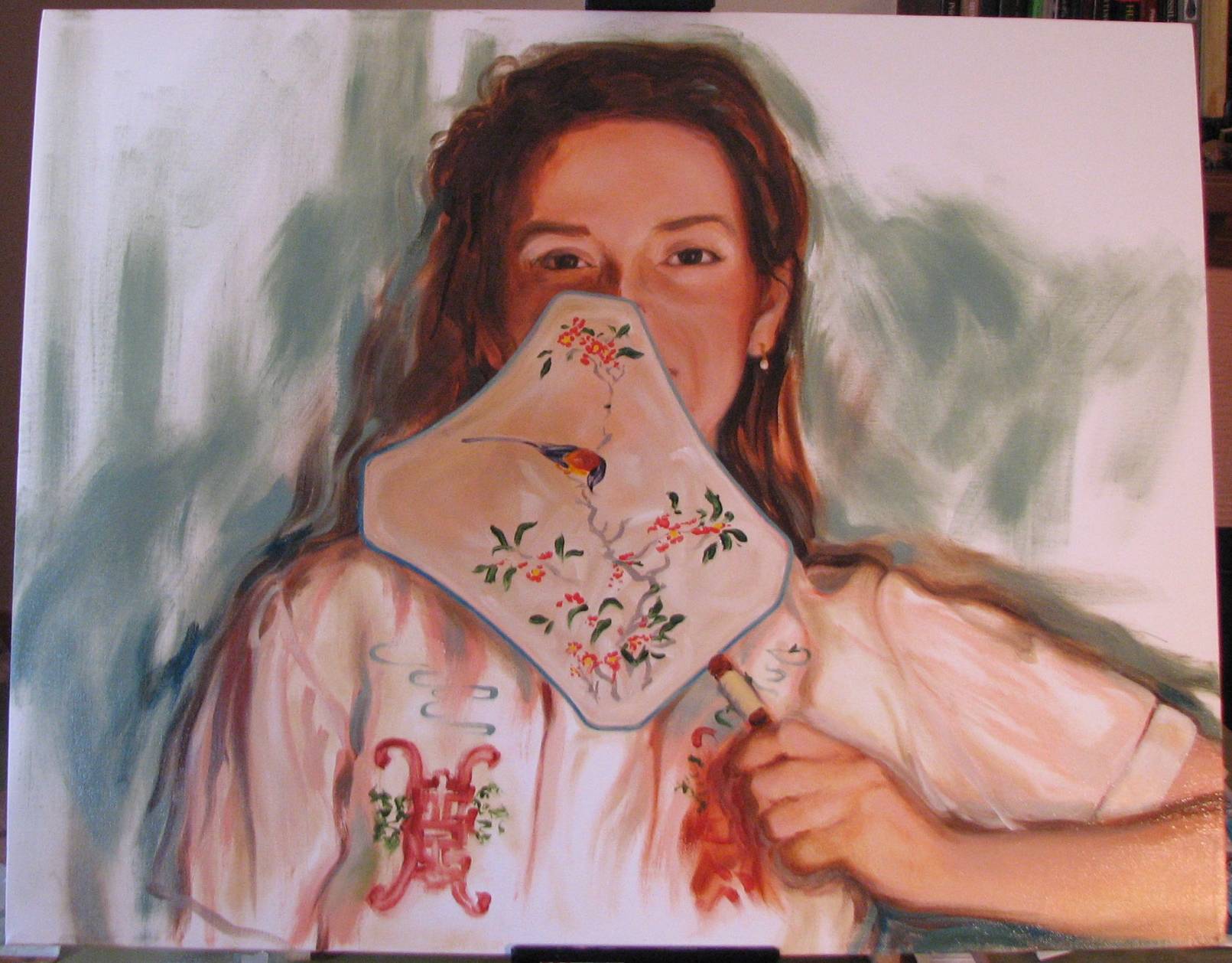
| 'Lisa With A Fan' 22" x 28" oil on canvas |
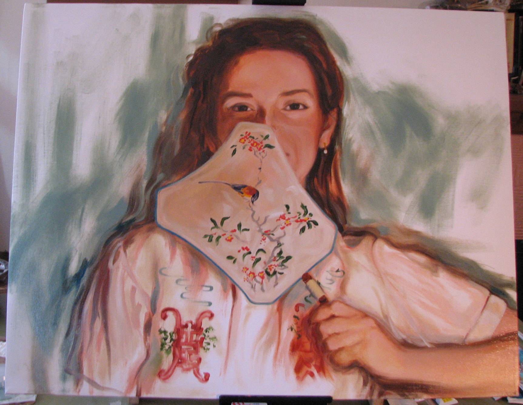
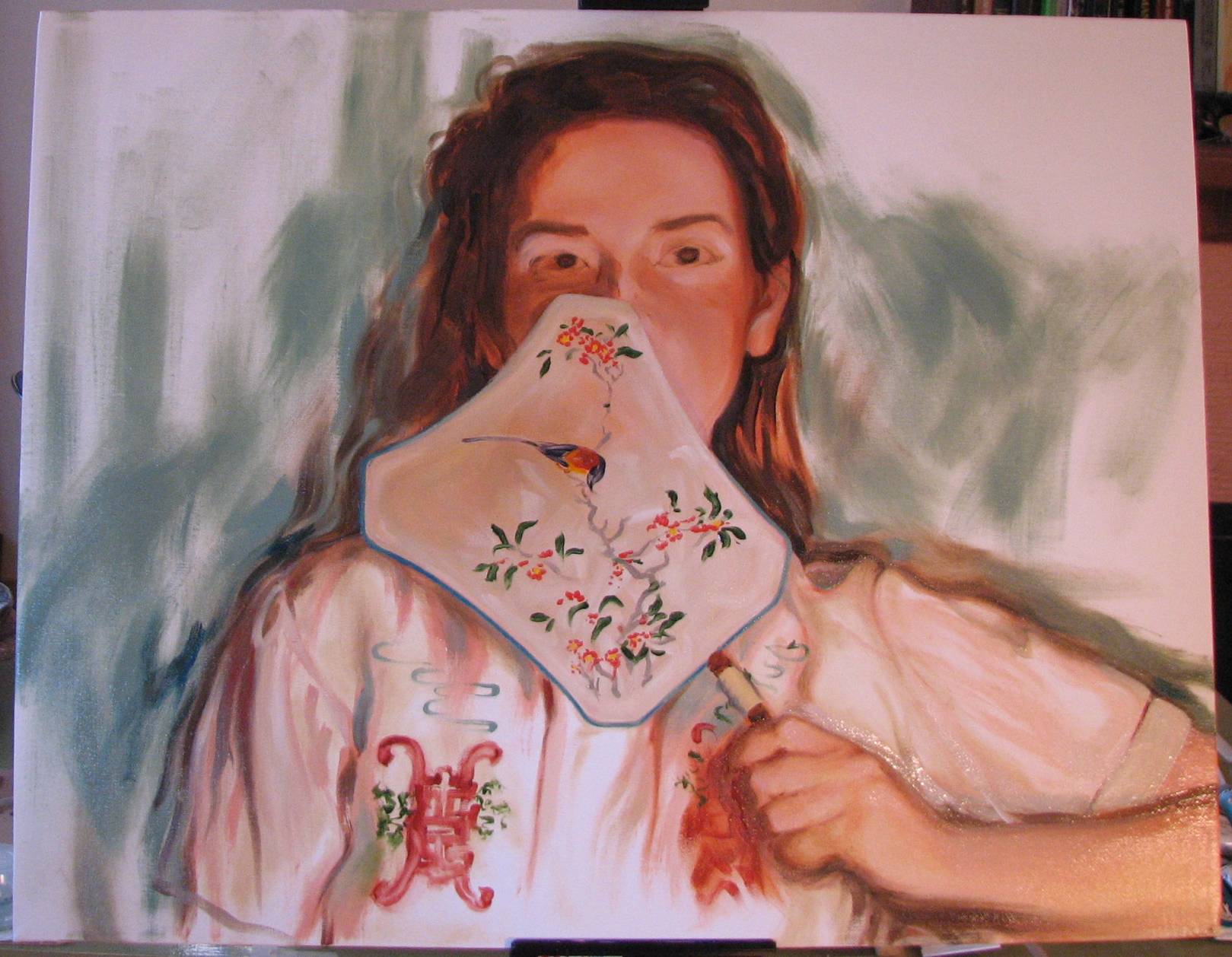
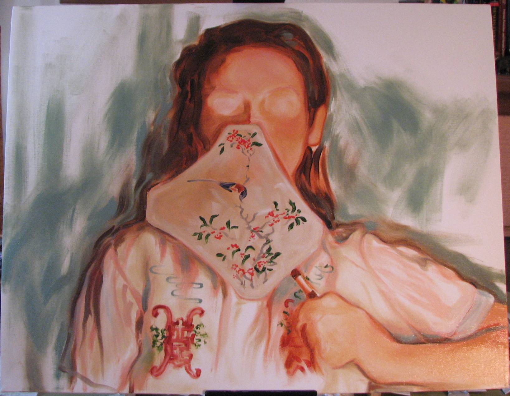
| January 27, 2011. I can see the finish
line...Most of the major tasks of this
portrait are completed, but there are a few secondary issues to
deal with before I can determine that this painting is done.
The hair needs just a few darker values and some brighter
highlights in select areas. Her forehead looks a bit flat
and needs some subtle modeling, and the hairline also needs a
little softening. The hand is just about where it should be, but I've got to make the small sliver of upholstered arm rest under her arm a little more distinct in color and value. I diddled with it last night, but the color is too similar to hue and value to the background as it is right now. And finally, her cheek is still not quite the correct color and values. It may not appear so in this photo, but the skin of the cheek is just a touch on the gray side, and I need to be able to work on it when I have no other big projects going and I can really focus. I painted the walls of our soon-to-be art showroom yesterday with paint into which I added some very coarse texturing particles. This made the wall paint VERY hard to roll out, and it took me 3 hours to paint 2 relatively small walls! I like the appearance that the texture gives, but it's a bear to apply. Today I paint the ceiling of the showroom, but I've decided not to use the texture, just paint it with regular, untextured paint. All this means that the last remaining work on my sister's portrait may go a little slower that usual, but I do expect it to be done by the end of this coming weekend. Stay tuned... |
 |
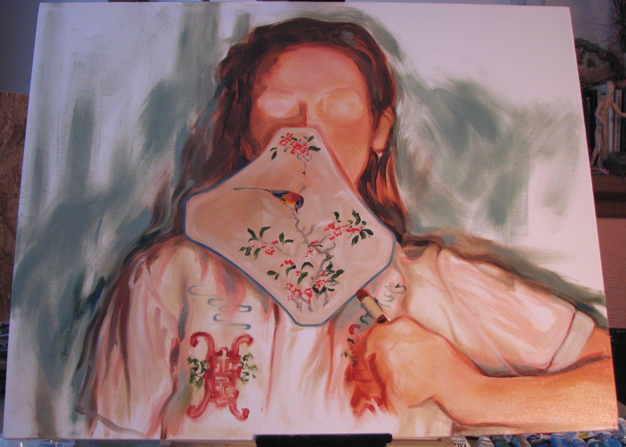
| January 26, 2011. Going against type.
I already blogged about the primary motivation behind the oil
portrait of my sister in oriental motif, but I also have to
admit to a desire to redefine the increasingly common ‘young
babe in Asian get-up’ type painting. The Impressionists and
Post-Impressionists were very taken with oriental art and tried
to incorporate some kind of Asian influence into their work,
superficially at first by using props and costumes, and later by
actually adopting Japanese artistic conventions of design,
composition and color/value treatment. Probably the most notable
19th century artist who delved into Asian influences was
Whistler, but there are others, such as Mary Cassatt and even
Van Gogh. I now often see contemporary representational artists similarly incorporating Asian props and costumes into their figurative work. The typical depiction is a young woman in (nothing but) a kimono or Chinese robe, and sometimes the figure holds a fan or an oriental ceramic vessel. The artist customarily treats the figure as a rather distant, emotionally neutral object of beauty, much like a piece of oriental porcelain, or an exotic floral arrangement. The figures are always attractive young women, and often there’s a bit of tasteful ‘cheesecake’ to the whole concept. My portrait of my sister is my redefinition of the type. She’s a beautiful person, both in appearance and in character, but I’m not presenting her as a distant courtesan or concubine. The format brings her right up close to the picture plane, and she gazes straight out at the viewer with directness and amusement rather than demurely looking away. Just because a subject has been done by many artists over time doesn't mean one can't approach it with a new twist. It can be fun to take a commonly done subject and reinvent it in some way. |
| January 25, 2011. Short & sweet: these eyes. I'm priming and painting the showroom, which is getting really close to being done, but I wanted to post the progress on my sister's face, particularly the eyes, which are so crucial to the emotional state in this painting. I'm also working on the skin tone of the face, which isn't quite where I want it at this point, but the overall form is getting there. The corner of her mouth is just barely showing, but it's critical to get it placed correctly, and for it and the smile crease in the cheek to have just the right quality without being too emphatic. |
 |
| January 23, 2011. Morphing, sculpting,
shaping. Over the past two days I've
been working to get the hand, wrist and arm right, and I started
defining the head, trying to solidify the overall shape and
contours. She's tilting her head slightly to one side, and
the outer contours of the skull have to be in sync with the
slight tilt to her features. I really want to maintain
that tilt, so I'm taking extra time getting it all coordinated
before getting too far into the facial features. It's
getting there, but I'm not yet satisfied. The hand is
getting close to where I want it, and with a little more work
should be there soon. As I've found to be the case with all portraits, in addition to the big masses, it's the little details of the face and body that make all the difference, such as the slight tilt to the head, the precision of the arch of the brows, the slight hint of a smile in the eyes and cheek, and even the subtle character of the grasp in the hand and the posture of the arm. 'Close enough' isn't good enough--it's got to be spot on. Because I know my sister's face so well, I'm even more hyper-sensitive to miscalculations and distortions in the form and features. |
 |
| January 22, 2011. Gimme a hand? Most art students
take some life drawing whereby the student becomes familiar with
depicting human form by drawing models via direct observation. Some students take this study further by enrolling in an anatomy
course to learn the human skeleton and muscles. My training,
however was unusual in that I also spent several years working
in scientific illustration as I worked on my master's degree in
physical anthropology. As a student of anthropology, I became
more familiar with the human skeleton, especially the primate
hand, than I ever imagined was
possible when I was an art student drawing the model.
Hands in particular have a reputation for being difficult for
artists to draw and paint convincingly, and in those instances
when I have hands to depict I tend to spend a great deal of time
on them. After what I've been through in my training, if I
can't do hands well I simply have no excuses! My anthropology human osteology course began with the histology of bone, followed by bone and cartilage formation processes. We learned the bones of the skeleton, including memorization of hundreds of minute bone features. Our lab practicals included a 'black box' exercise in which human bones, non-bone objects, and animal bones were placed together in a closed box. Through an opening in the box, we were to expected to identify by touch alone what the items inside the box were--no peeking. The final weeks of the course involved a survey of human bone pathologies, followed by techniques for estimating age, sex and probable ethnicity of human skeletal remains, as well as formulas for estimating total body stature using measurements from individual long bones. This course was followed by two more specialized osteology classes: non-human primate anatomy, and bioarchaeology. But wait, it didn't end there--my graduate research involved even more study of bones. For my thesis work, I gathered metric data from the finger bones of a wide range of primates, a project which utilized the osteology collections at 3 natural history museums in the country. In order to maintain some consistency in methodology across my study, I took measurements from right hand bones only, which necessitated sorting commingled primate hand bones into their left and right sides before I could even begin to take the measurements I needed (I quickly learned that even if the specimen in the box appears to be sorted, yep, it's been scrambled!). By the end of my data collection, I had taken approximately 10,000 finger bone measurements from species of multiple primate genera. It may sound like an excruciatingly dry task, but it was during this kind of intensive data collection that I was able to appreciate the fascinating individual variation present in primate skeletal form, including humans. Between my scientific illustration and my anthropology training I became extremely familiar with skeletal anatomy, and it has influenced both my figurative and still life work. Of course, it's not necessary for art students to delve into skeletal anatomy to this degree, but that's how my circumstances happened to evolve, and it was an incredibly engaging odyssey. Now, back to painting my sister's hand... |
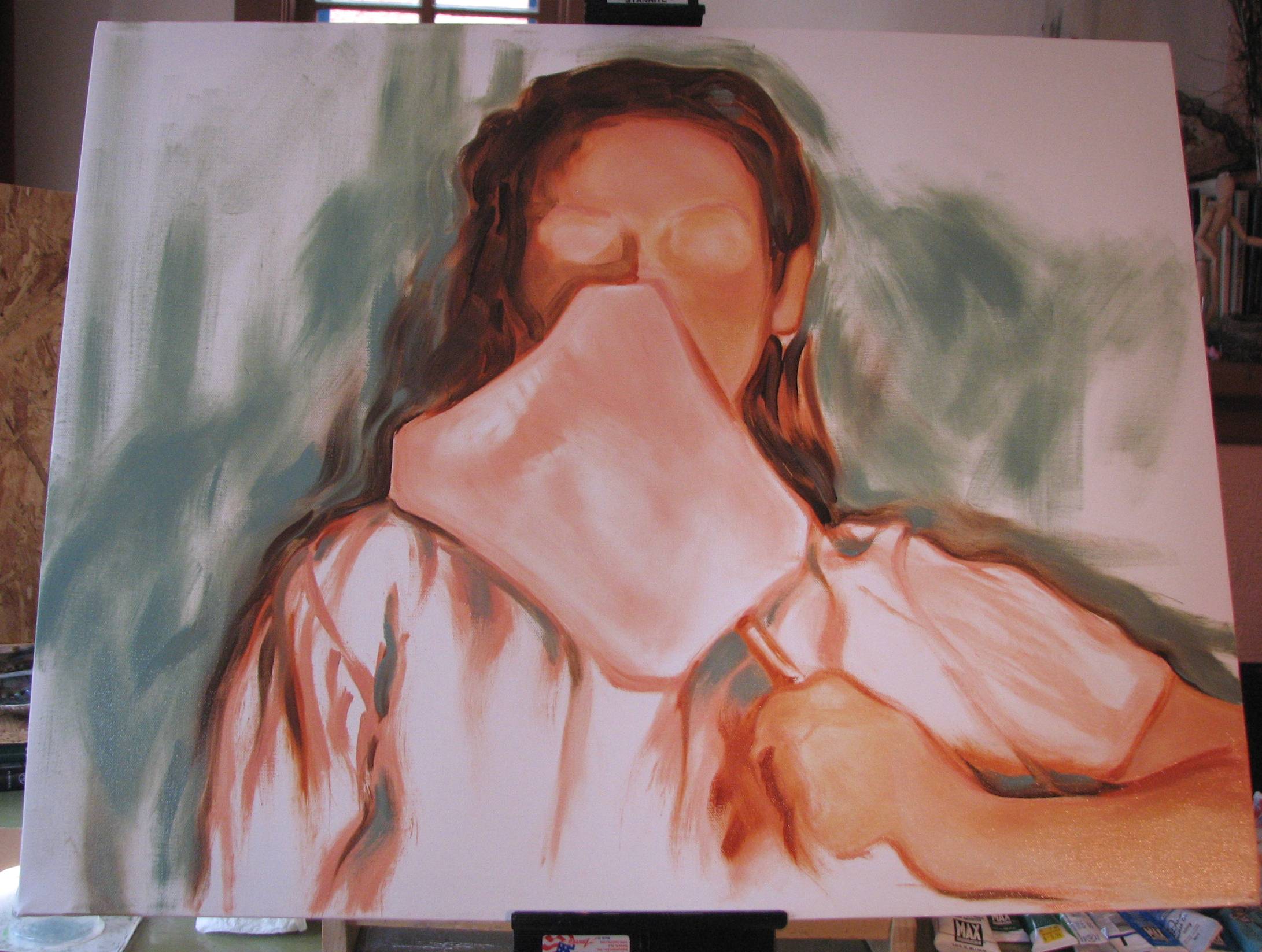
| January 21, 2011. Defining the hand.
As I began to define the hand last night I
discovered that the fingers and palm were too broad and husky,
so in order to address this I had to adjust the length of the
hand and also raise the wrist, which then raises the level at
which the lower arm is resting a bit. I'll have to
determine the final thickness of the wrist and length of the
lower arm before the hand and arm are truly finished. I
also began to position the eyebrows, but didn't go into the face
any more than that during last night's session. I made a miscalculation at the start of this painting; I should have positioned her slightly further to the left of center. It's not a major issue, but I would like to have had more of the arm holding the fan included in the composition, and a little less negative space on the left side of the painting. There is no one 'right' solution to any given painting, only that some solutions can be better than others. At any rate, the eventual success or failure of this particular painting depends on many factors, so I'm not terribly concerned. I'll give the hand/wrist/arm a bit more attention this evening, and perhaps even start real work on the face. |
 |
| January 20, 2011. Edges, or 'WWDD?'
('What Would Degas Do?').
I read a lot about the importance of
'edges' these days, but it's an old, familiar subject to me.
When I was in high school I discovered the work of Mary Cassatt
and her contemporary Edgar Degas, who were, in my opinion, a
couple of the true masters of the 'lost and found' edge. Of
equal importance, they were also masters of selective focus, in
which the focal areas of a painting or drawing were given the
greatest development or finish, while the peripheral or
secondary areas of the composition were summarily executed,
often almost to the point of abstraction. Yes, we have some
contemporary representational artists who are skillful in edge
treatment, inspiring battalions of emulators enthusiastically
flicking edges left and right with great conviction, but I would urge artists
who really want to learn about edges to look at the
work of Cassatt and Degas, as well as the extraordinary
paintings of Toulouse-Lautrec.
They are, in my opinion, a few of the great masters of edge and
line treatment.
Contours and focus were always treated in a manner that was an
honest, immediate response to the specific needs of the subject
and situation at hand, and thus there is infinite variety and
subtlety in line and edge handling in their work, which never
strayed into the dangerous territory of a compulsive technical
affectation or gimmick. Degas'
'Jeantaud, Linet and Laine' perfectly exemplifies these
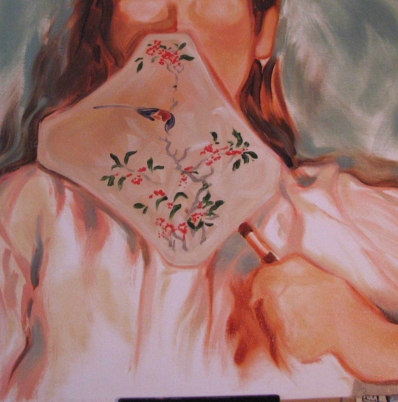
qualities of edge, line and selective focus. I think I resolved the arm/shoulder line to my satisfaction, and completed the bird on the fan. The red blossoms on the fan have yellow centers, so I'll do those tonight, too, but I can't finish the teal blue edge of the fan until after the face and hair are done. We took the day off yesterday to visit some Canyon Road galleries in Santa Fe, but this evening I'll be tackling the arm and hand holding the fan. |
 |
| January 18, 2011. Shirt detailing. Again, like the fan, I don't want to overpaint the embroidery on the shirt. The line across the shoulders, from the subject's left elbow to the the right shoulder/arm contour, is an important line, as it has a role in carrying or supporting the attitude of the subject. I'm still not quite satisfied with the overall sweep and turn of the entire contour, so I'll be giving it all a little bit more time. To me, this is the kind of attention to detail that can take a good portrait to the level of a great portrait, and I do try to literally step back from a given painting and really take a hard look at the big lines and movement. I'll have to adjust highlights and shadows in the folds of the sleeve, as well as perhaps strengthen or de-emphasize some contour lines in order to get the correct sweep and turn that I'm after. It's close, but not quite there yet. The sleeve of her left arm was too short, so I had to extend the hem some. |
 |
| January 17, 2011. Detailing the fan. The fan is an important element in the composition, in that the silk fabric is thin enough to allow diffuse colors of the sitter's face, hair and shirt to filter through to some extent. Thus I have to be careful to render its slightly transparent yet still opaque appearance correctly. I worked on the overall color and values of the silk, and then began detailing the Chinese painting on the fan, taking care not to fuss and overpaint the details. I'll have to let this much dry a bit so that I don't obliterate some nice passages with additional work. It doesn't need much more, but I'd like to develop the bird a bit further and recheck work on the transparency of the silk to add minor adjustments if needed. |
 |
| January 17, 2011. What a good sport!
We currently live hundreds of miles apart,
but when I was a younger artist my sister served as a wonderful
model for many of my drawings and paintings. She's a natural,
whether I caught her unawares or asked her to consciously pose
for some concept I dreamed up. We're 17
months apart in age and of all my siblings, she was around and
always willing. When I was 25 I saw an exhibit of Winslow Homer's croquet paintings at the Art Institute of Chicago, which sparked a brief Homer 'croquet' episode. I came up with the idea of recruiting my sister and her former husband to pose for me playing croquet in what I imagined to be genteel, summery, updated but Homer-ish garb. Because we each lived in apartments that had no real yards to speak of, we had to drive in search of an expanse of lawn to set up a few wickets to stage the mock 'croquet game.' We ended up in an unincorporated area outside of town, a mosaic of country estates with huge lawns and rolling woodlands called 'Bull Valley.' While we couldn't use the actual country club lawn there, we found a private residence with an expanse of manicured lawn and piled out of the car. We stuck a few wickets in the grass, my sister and her ex-husband did their best imitation of Homer's croquet players, and I quickly shot a roll of film. We grabbed the mallets, balls and wickets, hopped back in the car and tore off. I can only imagine the homeowners looking out the front picture window wondering who those people were playing croquet in their front yard-??? My second oil portrait is a new version of a charcoal and pastel portrait I did of my sister in 1987. I had seen a reproduction of Bartolome Estaban Murillo's 1670 oil painting 'A Girl and Her Duenna,' which depicts a teen-aged girl leaning on the sill of a window with her chin resting on one hand, and positioned slightly behind, her middle-aged governess/chaperone halfway hidden behind the shutter. The governess is wearing a long scarf on her head, and partly covers her smiling face behind the end of the scarf. Murillo brilliantly conveys the nanny's amusement through the eyes, cheeks, and forehead. After seeing Murillo's painting, I was intrigued by the idea of doing a portrait where I was similarly restricted in how much of the face was needed to express the sitter's psychological state. I came up with the idea of having my sister pose with a fan. I had a painted silk, oriental fan, she had an oriental brocade shirt with embroidery, and the result was the charcoal and pastel drawing that I eventually exhibited in the 1987 Gallery Ten regional juried show in Rockford, Illinois. I wish I had a digital image of the original charcoal version, but that was well before digital cameras and the drawing left my hands shortly after I completed it. I began laying in this new oil version of that 1987 drawing Friday. Yesterday I started blocking in some of the flesh tones, and began some of the background. The color palette I used in the charcoal version was fairly bold and strong, and while the colors of the fan and the embroidery of the shirt will still be bright, the overall color harmony in this oil version will probably be softer than the original charcoal and pastel. The key to this painting will be how well I can express the emotional and mental state of the sitter, even as the face is partially filtered by the fan. |
 |
| below: results of the first session |
 |
| January 15, 2011. 'Bailarina en
Reposo' done! Being my first oil
portrait, I was a bit unsure at first, but manageable, daily
work sessions, reliance on drawing instincts and simplification
kept me out of trouble. I
really can't wait to start another oil portrait, but I've been
invited to exhibit in the annual Northern New Mexico Devotional
Arts Exhibit at the Ray Drew Gallery at Highlands University,
and I need to have a couple new pieces completed for that soon.
My husband and I went to do some errands in Albuquerque yesterday, and after lunch we visited the art museum there. Unfortunately one of the museum's galleries was closed for exhibit construction--we have an uncanny temdency to visit museums in New Mexico on the days when exhibit halls are closed like this--but we were still able to see other temporary exhibits and some works from their permanent collections. Since moving to New Mexico I have become a huge fan of New Mexico's regional art colonies, which originated in Taos and Santa Fe at the end of the 19th century. I picked up a wonderful book on one of the founders of the Taos Society of Artists, Ernest L. Blumenschein. I'd seen his work in reproductions before, but when I turned the corner and was confronted face to face with his 'Star Road and White Sun,' a double portrait of sorts measuring at least 3' high by 4' wide, I was just about knocked off my feet. Talk about being "mugged by art," as Columbia University art historian Simon Schama refers to this sort of sudden and sideblinding experience with great works art. Blumenschein dealt with a wide variety of subject matter in his art, but I find his portraits and figures most compelling. I would urge anyone unfamiliar with New Mexico's historical art colonies to take a look. Most people immediately think Georgia O'Keeffe when they think of New Mexico art, and rightly so, but there were so many really exciting artists working in this area from the late 1800's onward. Until I moved here I just had no idea. I'm still discovering new artists from that period, and we've been living here almost 7 years. |
 |
| 'Bailarina en Reposo' 20" x 16" oil on gallery wrap canvas |
| January 11, 2011. Getting close!
An artist once remarked to me after seeing
a portrait I'd done that "I can see her thinking!"
I could not have summarized what I was after better than that.
The ultimate goal, whether I reach it or not in any given
portrait, is to be not just a painter of accurate likenesses, or
to master a checklist of technical characteristics, but to peer
a bit behind the outward posturing of an individual to get at
that inner self. A subject's emotional and mental state is expressed in many ways, from the slight furrow or raising of a brow, the narrowing squint of an eye, to the barely perceptible turn at the corner of the mouth or set of the jaw, to the focus or clarity of the eyes, as well as carrying through the posture and attitude of the entire body. I won't be satisified that this current portrait is finished unless I think I've been able to access some of that psychology. It's not quite fully 'there' yet, but I'm getting closer and closer each day. When I'm working on portraits I consult my reference books on the portraiture of Rembrandt and Velazquez, who were probably the best "psychologist[s] of the human condition," as Columbia University art historian Simon Schama puts it so well. William Adolphe Bouguereau just doesn't reach me, and in spite of his technical dazzle, in my opinion he never plumbed the depths of honest human experience the way Rembrandt and Velazquez did. Last night I lowered some of the values in the shadowed skin tones of the arms, and did some continuing work on various areas of the face. |
 |
| January 10, 2011. Developing the features. I took my own advice over the weekend and made a conscious effort to stop intellectualizing the process and just paint by feeling and instinct, which served me well in the past. I've been doing portraits in charcoal and graphite for years, and while I still have a lot to learn when it comes to other types of subjects, I do feel portraits are my oldest and strongest area. I did my first serious portrait when I was about 23 and still in college, a charcoal portrait of my sister. I simply followed my instincts: |
 |
| Yesterday I worked on
refining the skin tones of the dancer, mostly in terms of the
middle values, and then began to develop the features.
I'll be addressing more of the highlighted and shadowed areas of
the face this week, and I'll also continue work on the features.
I've found that a portrait passes through a critical mid-stage where the features either fall into their rightful places or they don't, and while other areas of the portrait may be well done, if the core of the portrait doesn't hang together those other successful passages don't matter. If it doesn't come together it is because of some earlier, inherent miscalculation that probably can't be addressed without a radical reworking of the fundamental structure of the head. It is through experience that one learns to check early for these initial structural considerations so they don't lead to problems down the road. I'm at a point with this portrait where I can see the light at the end of the tunnel, and I can relax because I know I've jumped the really critical hurdles. |
 |
| January 8, 2011. Think less.
When I was a much younger artist there was
no internet, no art blogs, no art web sites or discussion
boards. What I knew of art I got from art history and
studio courses, studying lots of art books on my own, seeing
some art in person, occasionally talking to a few other
artists I knew, and most critically, from just doing. Compared to what is presently available
for artists it might seem as if artists working back then were
fairly isolated. We are now blessed by an embarrassment of
art resource riches, right? As I was continuing work on the oil portrait of the dancer today, I vacillated over how to execute some brushwork in the background, and thought wryly about how nonchalantly I would have handled the same passages back when I was younger and working in much greater isolation. I realized with some irony that in my isolation years ago I was actually much more naturally intrepid. I didn’t think so much. I just drew and painted in relative oblivion to much of what was occurring elsewhere, and in many ways that was kind of liberating. I wasn't as conscious of the judgment of 'peers,' whoever they might be (?), I wasn’t always going over a mental checklist of critical qualities ("edges! drawing! brushwork! composition! color!" etc., etc.) that representational artwork is judged by, or fretting about the stylistic and technical trends and affectations sweeping through current representational art. All that sort of thing was pretty much off my radar. And I certainly don't recall clutching up out of fear and uncertainty regarding the outcome or success of some spontaneous impulse I might have. I just plunged in, and whatever happened happened. Access to so much art information these days is a wondrous thing, but I realize I have to consider the possibility that too much may have somewhat of a clutch effect on me. Sometimes we have to put a little distance between our brains and the glut of images and information beckoning us--or bludgeoning us. As for the portrait, I added some lower values in the dress, developed more of the ribbons on the sleeves, described the earrings, did some further toning of the background, and began work on the face. I'll be working more this evening on the face, and whatever happens...it's all good. |
 |
| January 7,2011. Skin tones.
I spent some time yesterday afternoon
working on the hair ornament, which has some complexities but I
don't want to overpaint it. This ornament with its flowers
is essentially a mini still life and I'm trying to use a few
brushstrokes as possible in order to describe the elements.
There is obviously some black in it, but I have to decide how
dark it really needs to be, and that may have to be determined
after I have some darker values going in other parts of the
painting. I used mostly a thinner glaze of Payne's gray
over the red underpainting, and a few touches of actual black
here and there. Last night I took a deep breath, mixed up a flesh tone and began work on the arms and face. I didn't expect to get a lot done, but focused on glazing over the red underpainting without entirely obliterating it. When I felt I'd done enough on the skin tones for one session, I worked on a few of the hot pink ribbons on her shoulders and sleeves. |
 |
| below: the previous night's work beginning to tone the background, and detailing the hair ornament & dress |
 |
| January 6, 2011. Blocking in some color. Being that this is the first oil portrait I've ever done, I'm dealing with it in manageable portions to begin with. I began blocking in the color in the hair ornament last night, a fun--and thus less intimidating--area to handle. The white and yellow blossoms may be a bit too high, but I can cut in and make them more compact when I introduce some background toning. As to be expected, the face will be the main challenge, so I'm thinking about it a bit before I go any further there. I drew this dancer in full figure in charcoal with some touches of pastel a couple years ago, but I've been thinking of doing a cropped down portrait exactly like this ever since. The main concepts I'm keeping in mind are the sunlight, her casual, unselfconscious posture and expression, and the riot of color in her outfit. |
 |
| January 5, 2011.
And now for something entirely
different. I'm taking a break from the still lifes to try
something completely new for me: an oil portrait. I've
done many portraits over the years and paid a lot of bills with
commissioned portraiture, but my portrait work up until now had
been done in charcoal, graphite and watercolor. When I
started oil painting in August, portraits were deep in the back
of my mind but I knew I had a lot of work to do before I could
even think about attempting any. I started oil painting
with a couple small landscapes and then seized upon still life
as a good, tried and true method of learning how to handle oil
painting. In the process, however, I discovered that still
life painting in and of itself is a really interesting form,
thus I've been delving deeper into still life painting without
constraint. I guess I'm feeling a little more intrepid,
and decided that maybe it was time to get my feet wet with oil
portraiture. Regional dance forms have been the subject of a lot of my work here in New Mexico, and especially the form called Baile Folklorico. My dance compositions have typically involved a lot of movement, but this time I'm choosing a dancer at rest. I love the elaborate assemblage in her hair, and her slightly skeptical or guarded expression. I use photographic references in a lot of my work, particularly for subjects involving motion or when I'm interested in people unselfconsciously engaged in the activities of real life. The main thing I'm going to say about the use of photography by artists is that a skilled and judicious artist can use photography wisely and paint equally well from either direct observation or from photographic references. Painting or drawing from life or plein air is no guarantee of a successful work of art. It's in the brain of the artist more than the method or mode, but there are a lot of people making a lot of money convincing artists otherwise (see my blog entry from November 18, 2010--it's another manifestation of that 'piece of the pie' thing.). There are different objectives and satisfactions to be gained from working in either mode (i.e., if an artist wants to depict something other than deliberately posed models in a studio, plaster casts/statuary, and still lifes then you need to be able to access other subjects), and that's the main reason why artists should consider working in both ways if they want to. OK, I'll get off my soapbox now. |
 |
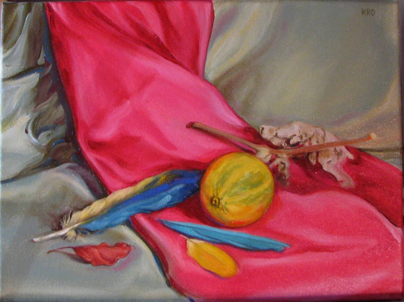
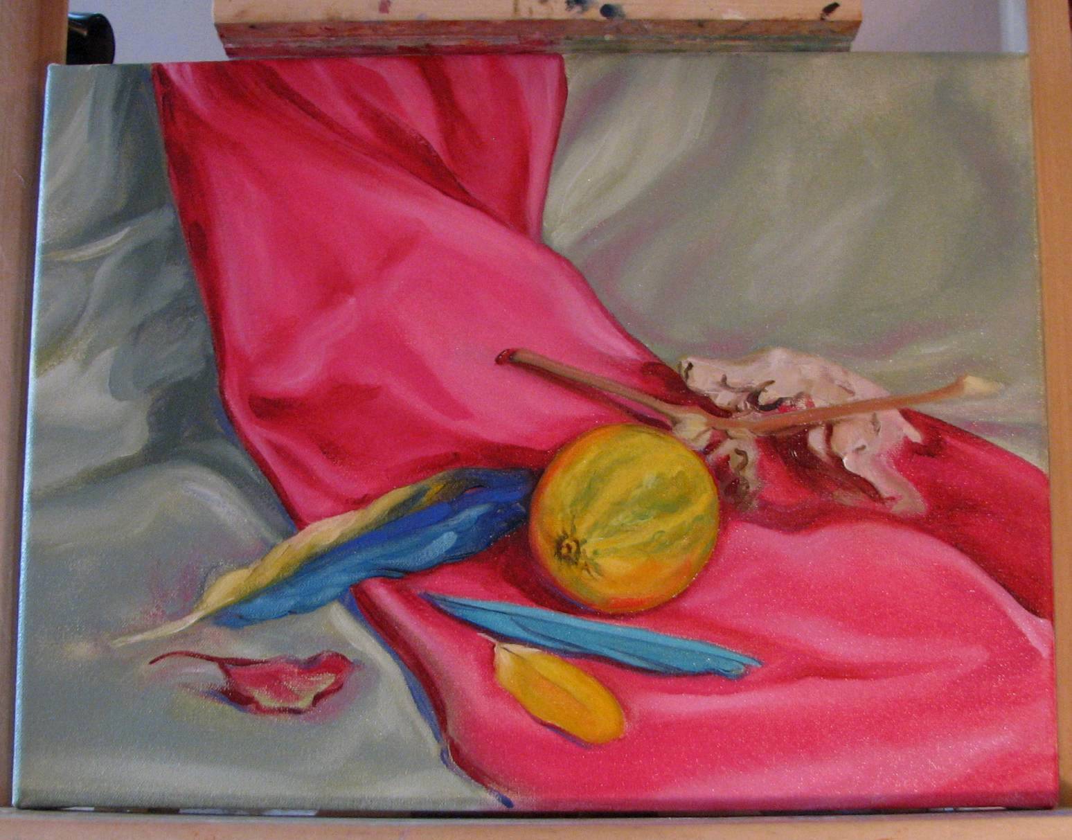
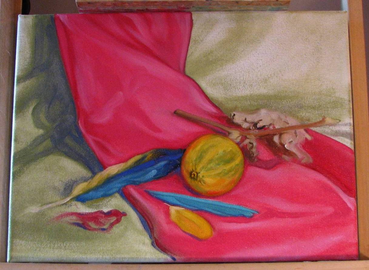
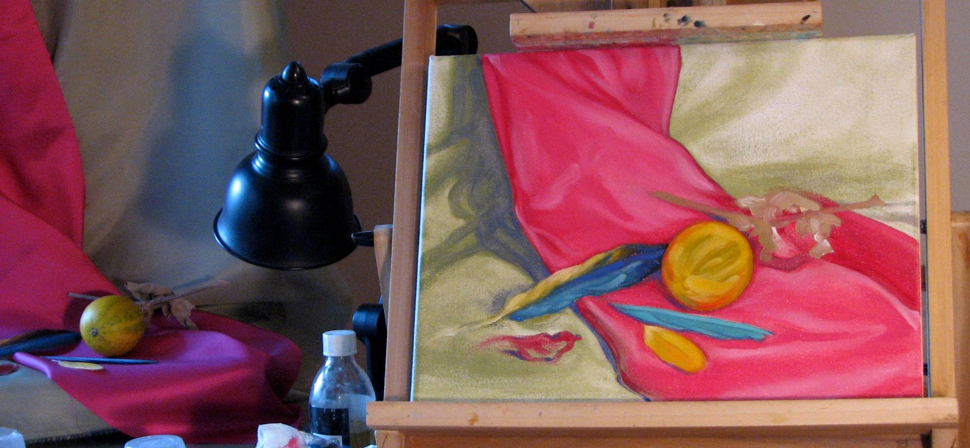
| January 4, 2011. Calabazilla done!
The wild gourd I depicted in this still
life is called a calabazilla, or buffalo gourd, and it
grows everywhere around here, even in the alley outside my
studio windows. During the summer the vines are covered in
large, wing shaped green leaves that look like grounded flocks
of birds, and the trumpet shaped flowers are an apricot color.
Sitting on a table in my studio is a very long section of the
vine with about a half dozen gourds still attached that I
scavenged from the side of the road back in October. I'm
not sure where or how to store it, but the cats have discovered
the gourds so I'll have to put it somewhere soon. One of
the cats also discovered the gourd and feathers I used in this
still life, because I noticed it had been subject to a little
'rearranging' over the weekend. As I noted several times below, I tinkered with the green fabric for a couple days, not really knowing what it was that I was unsatisfied with until I inadvertently made an adjustment to the shadows of the fuschia fabric in the area under the dried leaves of the gourd. Suddenly it all came together. While the green areas certainly needed the adjustments I made, it wasn't really the green that was causing the lingering problem--the source was elsewhere, in the fuschia shadows. So the take away lesson for me is that if I'm having a problem with what seems to be a specific region of the painting, consider examining the composition as a whole for the cause. Getting good quality, official photos of artwork is an ongoing struggle for me, and this task is even more difficult with oil paintings, I've found. Specks of glare and color and value wash-out plague my efforts to get accurate photos, so today I'm trying a new tactic. I set up two light sources, one on the left and the other on the right, and angled them toward the painting. This seems to help cancel out a lot of the glare, so I'll be experimenting throughout the day trying to get the optimum angles and height. The photo below is fairly good in most respects, except there is an oblique streak of shadow from the window crossing up the lower left quadrant of the painting. |
 |
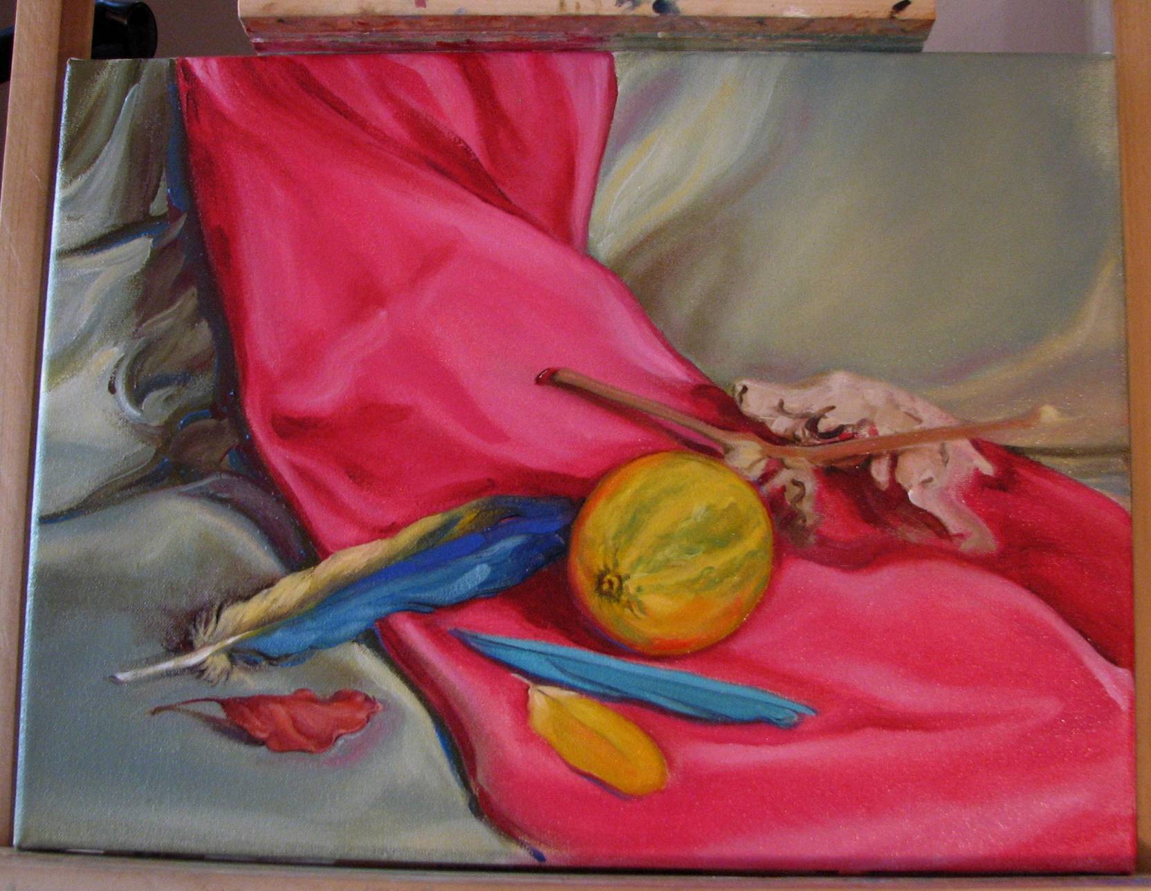
| January 3, 2011. Close to the finish line...I've been working at gradually removing the scrubby 'murk' in areas of the green fabric, and also making various adjustments to the red leaf. I think one more evening on this ought to address any remaining issues. Because of its shifting and changing appearance, the toughest area of this painting has been the shadowing in the green material along the fuschia fabric on the left of the painting. In reality there are some very dark areas in that shadow, but if painted as dark as they are they created a problematic abyss--a black hole-- in the composition that was much more apparent in person than in these photos. |
 |
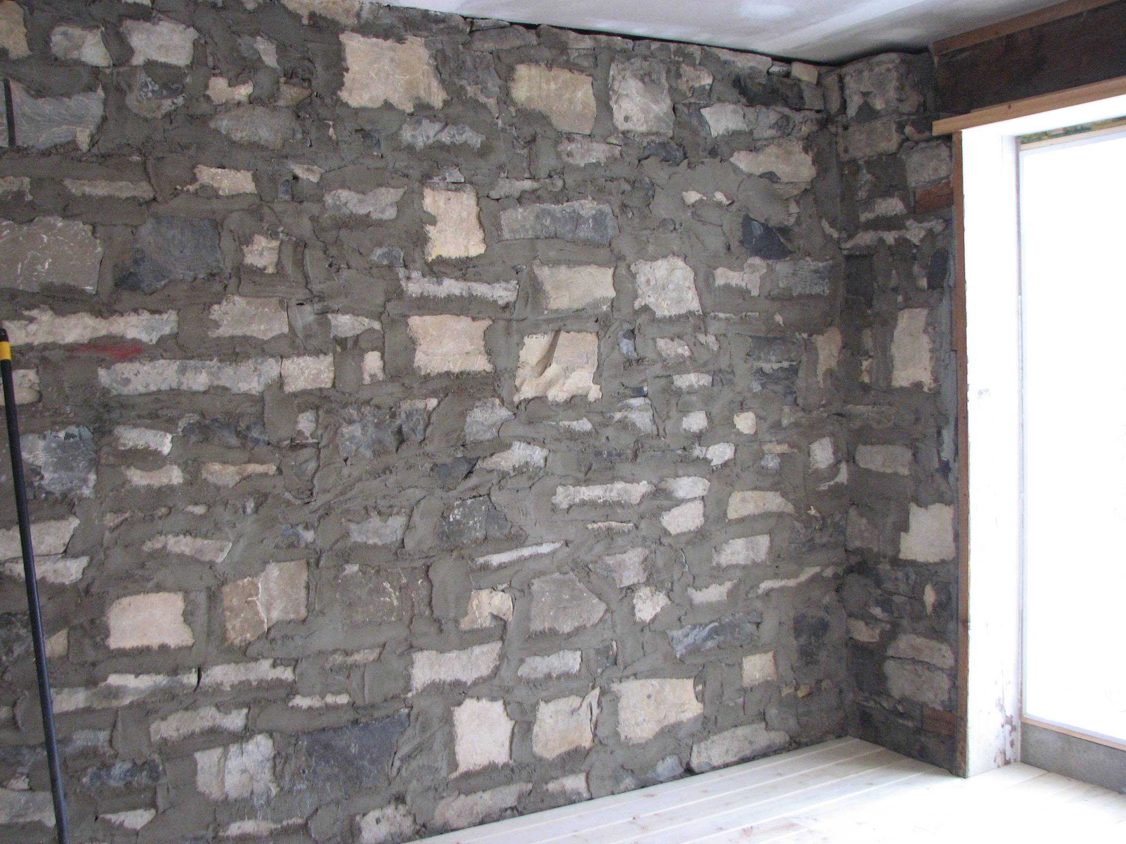
| January 2, 2011. Showroom floor installed! In November my husband and I started renovating an old stone building on our property into a showroom for our artwork. We've reached the point where we can begin to see the light at the far end of the tunnel, after weeks and weeks of work. First we installed glass block panels, and then framed off the space. We drywalled and insulated, installed a small woodstove and chimney, and this week the pine flooring went in. There is still a lot of finish work to be done before we're through, but it's beginning to look like a real space now. The walls and ceiling have to be painted, tile will be applied to the wall between the glass blocks, lighting has to be installed, and the floor has to be polyurethaned, but the really tough stuff is behind us. From old Sanborn insurance maps we've been able to determine that this stone structure was built around 1913. |
 |
 |
 |
| January 1, 2011. Fabrics and fireworks. New Year's Eve is a pretty quiet event around our household, at least until midnight when the rest of the town reverberates with the sound of fireworks. I worked on the drapery as well as the objects in the lower left quadrant as the new year rang in. The green drapery is unexpectedly proving to be the trickiest part of this painting, and I'm still not satisfied with the overall unity, so I will continue to work out the issues until I GET IT RIGHT! |
 |
| December 31, 2010. Deepening some values. The shadows in the green fabric are proving to be a little slippery to evaluate, as they appear to shift some from cool to warm, and lighter to darker. I started them with a low value of the local green and then some blue, and now I'm going to them with some thio violet. While they're gradually getting there, I'm still not satisfied with either the final colors in these shadows or the values, so I'll revisit them this evening. The bicolored feather and the small red leaf are patiently waiting for some more attention, but I really want to get the green fabric where it needs to be first. |
 |
| December 31, 2010. Betwixt & between:
a post-modern love child. In 2008 I went
to a small, outdoor art fair organized by an artist friend.
Among the wide range of artwork offered to visitors, I came upon
an artist's booth hung with very classically rendered portraits,
figures and still life paintings. I eagerly chatted with the
artist and discovered she had been receiving instruction at an
atelier in a nearby city. Her work was lovely, and I questioned
her about her training. It was from this artist that I first
learned about the Art Renewal Center, and its efforts to promote
representational artwork. Being a representational artist
myself, with a lot of traditional training in my own background,
I was heartened to hear that there seemed to be a resurgence of
representational artwork in the country, and perhaps
internationally. I went home to my computer to learn more about
this Art Renewal Center and this apparent incipient renaissance
in representational art. Oh, my. I am a representational artist, I always have been, and I likely always will be. In short, I love representational work--good representational work, that is. But I also love good non-objective art. In a bifurcated art world where one apparently must declare allegiance to one aesthetic camp or the other for both practical and political reasons, I find that I reside in a kind of limbo land. An artistic Siberia. Not anachronistic (or politically conservative) enough to join ideologically with the fervent disciples of the Art Renewal Center, but not really identifying with the agnostic totality of 21st century non-objective art, either. Is there anyone else wandering around this artistic no man's land with the same conflicted thoughts? Well, I propose an alternative. When 20th century biologists wanted to incorporate new discoveries about genetics and molecular biology into Darwin's essentially sound landmark 1859 publication on evolutionary theory, the resulting set of updated evolutionary theories was dubbed 'The Modern Synthesis.' I propose those of us who want to sustain the craftsmanship of representational art, yet who want to broaden the "measure of artistic significance" to include both objective and non-objective art, who acknowledge that while we can learn from those in the past we are nevertheless creatures of the present, who won't deny that the past century of art history happened--or more importantly, won't deny that something about it all mattered--call ourselves the 'Post-modern Synthesis.' But what exactly is Post-modernism? "The simultaneous presence of diverse traditions in a single work is indicative of what we have come to call post-modernism." Ah--sounds exactly like Synthesis to me! I can go along with that. |
| December 30, 2010. More work on the gourd and parrot feathers still life. I've been working a lot on the fuschia and green fabrics the past two nights (I worked on the green material when I had a mini migraine, which was probably not such a good idea--such is life). I think the fuschia is almost where it needs to be, but the green will need more attention because it was too yellow and I had to gray it out. There are numerous shadowed areas in the green that need deepening, particularly on the left side, and the objects in the lower left quadrant need a little more development. I'm pleased with the gourd, pink drapery, and feathers so far (this photo doesn't really do them full justice), and now the task is to get the green material up to that level. These are satiny type materials and while they do have distinct highlights and crisp edges, I don't want to detract from the focal objects. Thus I had to be judicious in my treatment of the pink material, and will have to be so with the green. |
 |
| December 29, 2010. Artist web sites: a
‘Can Do’ attitude. When I returned
to art in 2008 after 13 years of working in scientific
illustration and acquiring my master’s in physical anthropology,
how the art work had changed. The internet was responsible for
revolutionizing our lives, and the world of art was no
exception. I spent about a year examining artist web sites,
hoping eventually that I’d have my own. I had a lot of work
ahead of me first, however, and I put the notion on the back
burner. Three years and a lot of sweat later, I decided it was time. I was unaware that there were web site creation services for artists, so when I received word from the economic development office in my county that they were partnering with the local community college to offer a web site design workshop to the general public, I jumped at the chance. The fee for the workshop was minimal ($20), and we were able to purchase the web design software through the college, again at an affordable price. I ordered my software and I was in business. I had my site map all planned on paper—the most critical step--and my husband and I sat down to tackle the software. It was a bit rocky at first, but we persevered, and eventually my web site pages began to take shape. I was interested in a straightforward site that was easy to navigate. I was able to achieve just that. On the downside, there are still some features I haven’t yet mastered, such as an interactive function on this blog, and I still have some finishing details left to do, but overall I am not at all sorry I built this web site myself. My husband and I are, by nature, ‘do-it-yourselfers,’ and have been able to do many things around our property and in our home that we couldn’t afford to hire out, including our current project, rehabbing an old stone structure on our property into our art showroom. We bought an old, New Mexico vernacular Victorian house that was in essentially sound shape for $65,000., and over the past 6 years have brought much of it back to life through our own determination, careful planning and steady work. I am not the least bit sorry we didn’t hire out the renovation work. Perhaps if I’d known that there were art web site services available I might have gone with one of them rather than creating one myself, and who knows, in the future I may find that maintaining my web site will be easier and less time consuming if I switch to one of them. But one valuable thing I’ve gained from my decision to make my own web site is a sense of confidence that I can master something if I put my mind to it. Moreover, handling this myself means that as an artist I am giving away one less ‘piece of the pie’ to someone else. |
| December 28, 2010. Guest blogging. I was graciously invited to guest blog for Chicago based art critic and writer Brian Sherwin on the topic of art museum exhibit content, and my finished piece on the subject can be read here. Even though I may occasionally come to somewhat different conclusions regarding the various issues Brian blogs about, I really appreciate the thought provoking material and lively discussion Brian provides to his readers. |
| December 27, 2010. Grappling with the gourd. I worked some on defining the gourd, stem and leaf. The green striations on the gourd were a bit trickier than I had anticipated in that I had to be careful not to overstate them. We've been sanding drywall mud on the showroom during the day, so while I still paint every night the pace is a little slower, and probably will be for the next week or two. We'll be ready to install and then put the finish on the flooring by the end of the week, and that's another pretty exhausting job. We're anxious to get the showroom done, however, so we can transfer our finished art work there and I can rearrange my presently very crowded studio. I'd like to be able to use my large floor easel for some sizable paintings soon, but that's just not possible until I deal with the cramped quarters, and having the showroom will help considerably in that respect. |
 |
| December 25, 2010. Turning convention up-side-down. The beige stem and dried leaves of the gourd introduce some neutral accents into the composition, which deliberately reverses the usual proportions between areas of high to low chroma. Typically areas of high chroma would occur in much smaller proportion, but here they make up much of the composition. The neutral details provide an interesting contrast to these intense colors. These neutral details will be developed just a little bit more, but they don't need a whole lot of fuss. |
 |
| December 25, 2010. Don't drive angry. Good advice when you're behind the wheel of a car, but I'm going to suggest that when you're in front of a canvas, a little 'fire in the belly' is an unexpectedly useful thing. I've worked while in many different moods, ranging from refreshed and tranquil to fatigued and agitated, and I discovered something interesting. I paint better when I've become slightly frustrated with a passage that isn't quite working and I get a little mad at myself. I take a break, give myself a little kick in the rear and get back to the easel to DO IT RIGHT! I know what I have to do, so no excuses, JUST GET BACK IN THERE AND DO IT. Whatever the mental block is, it's channeled from frustration into physical arm and hand motion, resulting in bolder, more decisive painting and better results. Timidity, hesitation, confusion, and indecisiveness are an artist's worst enemies. The trick is to access that boldness, that decisiveness without having to go through the frustration routine in order to get there. |
| December 24, 2010. Attention to focal objects. I worked some on defining the focal objects last night. I work in bouts of wet into wet, followed by drying time, and subsequent bouts of wet into wet. It typically takes me about a week to finish a larger painting. My schedule and lifestyle don't allow for alla prima painting, and I've found that I can work with a combination of techniques. I'm also working on this particular painting at night using studio lighting, although most of my still lifes involved natural lighting in combination with some studio lighting. I'm building up the form and colors of the gourd in this still life in layers. Modeling wet into wet would obliterate some under layers of color and modeling that I want to retain, so drying time is critical to this painting. |
 |
| December 24, 2010. Devotional art in
New Mexico. Is there a bias in the mainstream art world
against, among several issues, contemporary images and exhibits with religious content, particularly
at publicly funded museums? I don't pretend to know what
is occurring all across the country, but here in New Mexico
we may be a place unto our own in that there is no lack of religious art, whether antique
images and relics, or contemporary pieces ranging from sculpture to painting,
drawing, prints, etc. The Southwest is a place where numerous
cultures and perspectives meet, some might say collide, and diverse images with
spiritual content are everywhere. And I mean
everywhere. For example, the Spanish Colonial
devotional arts santero tradition did not begin as 'art' in
the modern sense, but over time it has crossed boundaries so
that now it generates both traditional devotional imagery and a
class of 'art' objects embedded within the Southwestern art
market. In addition to churches and chapels, these devotional
images can be found in people's homes, in public and private
rural settings, in urban public spaces, in commercial and public
galleries, in shops, in public markets, and in our regional
history and art museums (my husband and I just saw the
'Threads
of Devotion' exhibit, featuring hand-made clothing and
acoutrements made for the oldest statue of the Virgin Mary (La
Conquistadora) in
the U.S., at Santa
Fe's Spanish Colonial Arts museum). The same can
be said for Native American spiritual imagery, to some more limited
extent, but the limits in this case do not come from the museum
establishment, as Native Americans themselves have increasingly
asserted their preferences for the contexts in which their
imagery may be collected and viewed. The art gallery of the state university located in
my city mounts a very popular devotional art exhibit every
spring, and last year was the first year
I participated. Being a public
university, it is indeed funded by tax dollars. My local
Arts Council, which is in part publicly funded, offers month
long exhibit space to artists, and I recently viewed a small
group show that included the Christian-themed work of a local
artist. In New
Mexico, I am just not seeing a dearth of religious imagery in
any context. I would also assume that there are
many contemporary spiritual or religious art images and objects
with less overt content which are not immediately recognized as
such because they don't contain literal references to their
religious content, much in the way that the
color field work of
Mark Rothko doesn't contain literal references to religious
concepts and imagery--or any imagery for that matter--but is a
deeply compelling spiritual experience for many viewers,
nonetheless.
One of the things my husband and I love about living in New Mexico is that people here are generally pretty accepting of diversity, and this tolerance is expressed in countless ways, including the arts. |
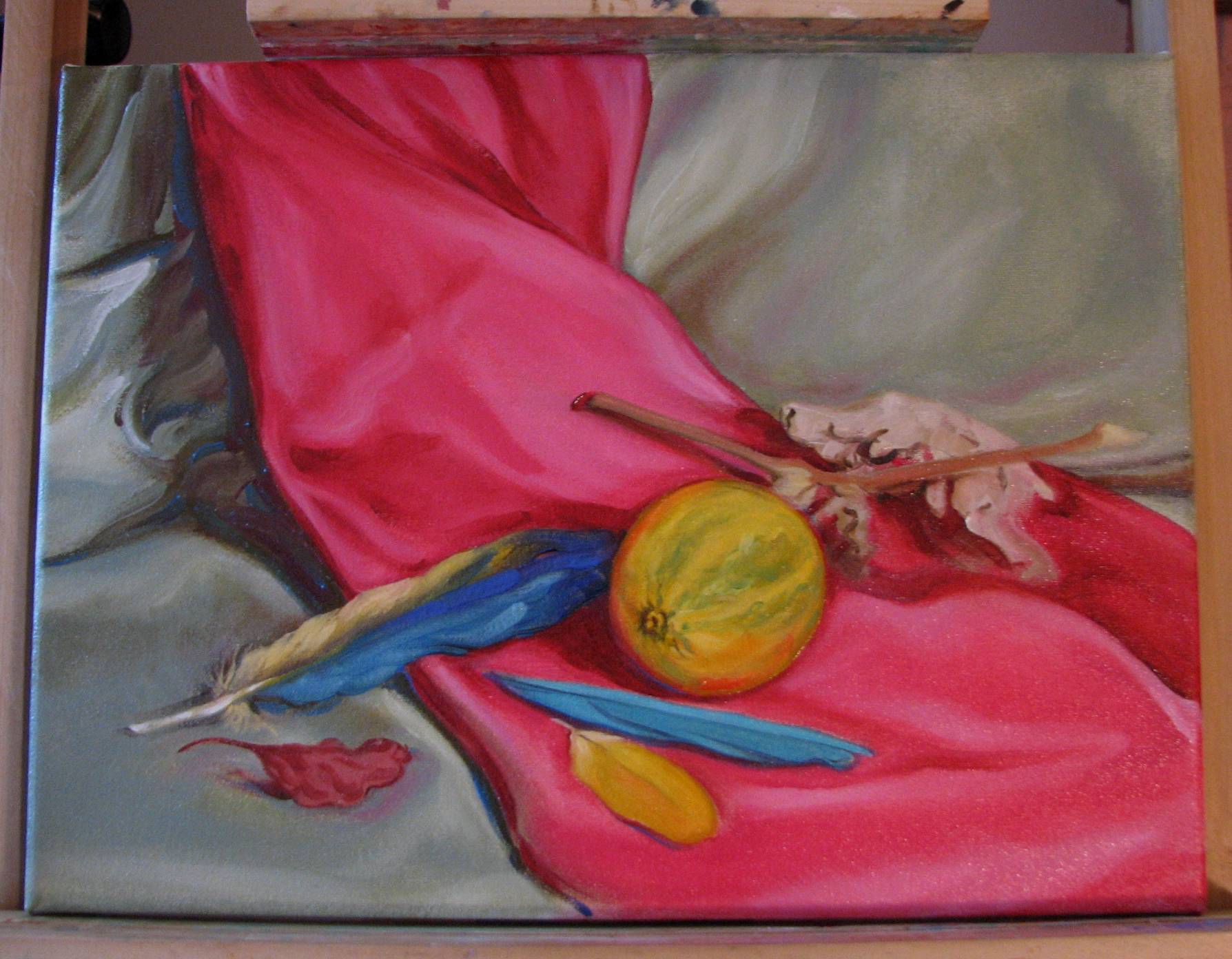
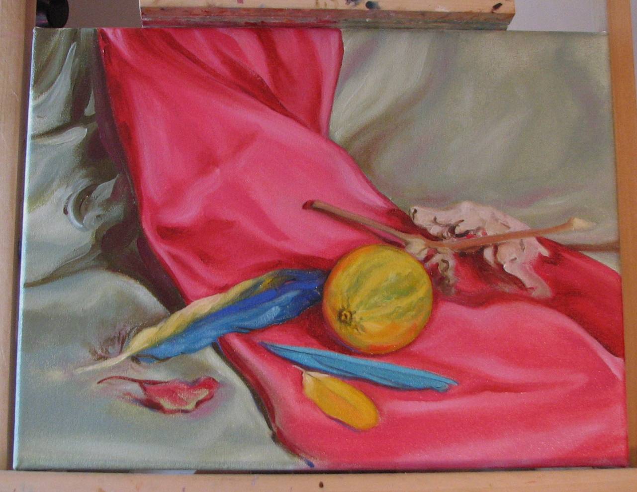
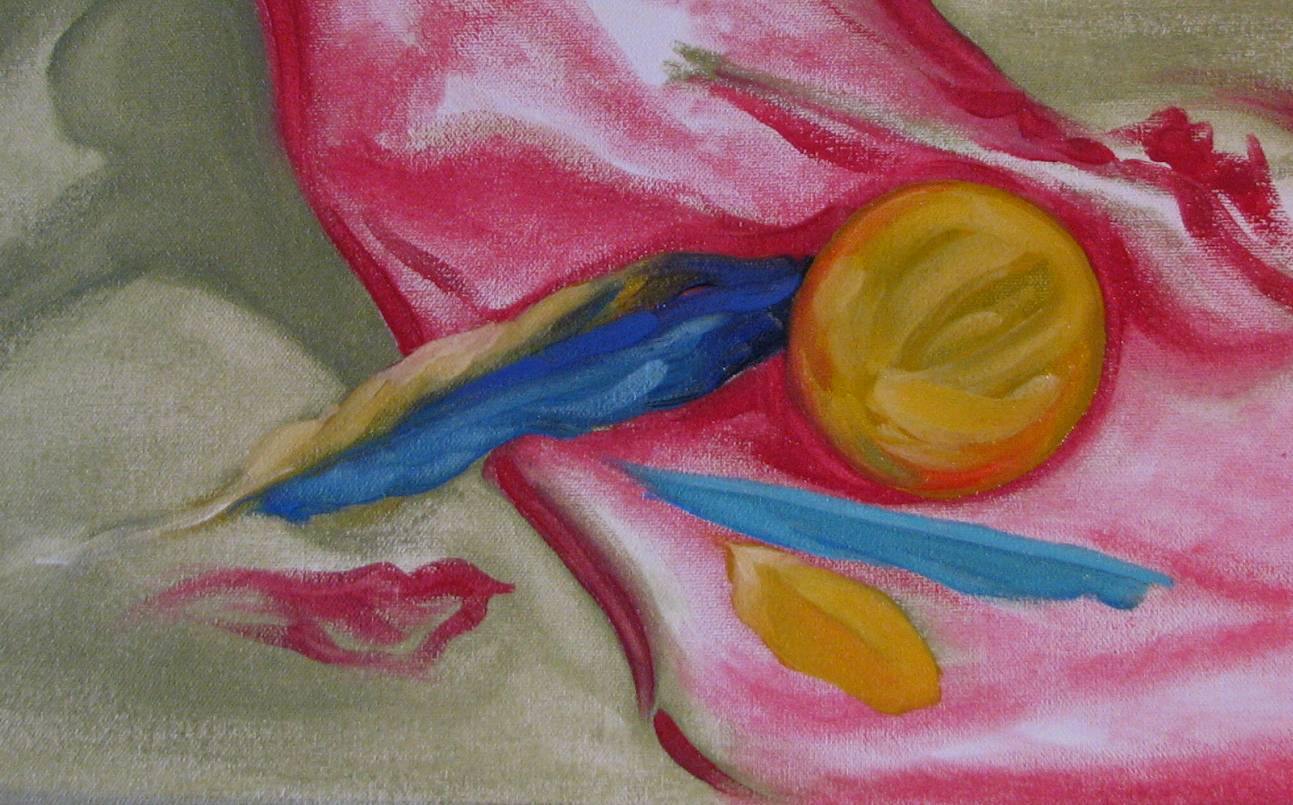
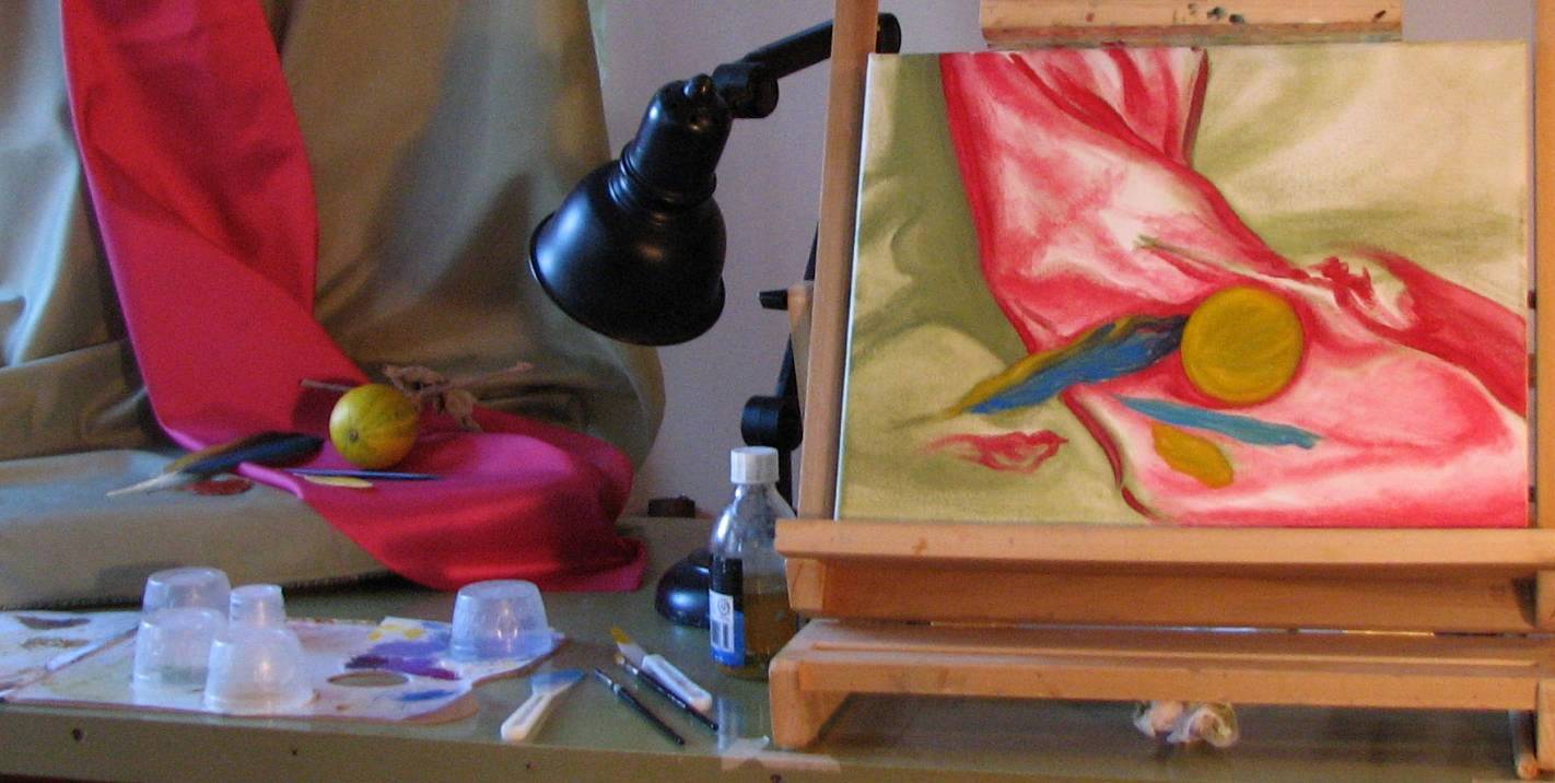
| December 23, 2010. Chroma gone wild! I had an attack of chroma that just came out of nowhere and took over my studio. I've been deliberately working in a high color and value key, using color in a more judicious manner, with the highly saturated colors placed in small, targeted areas of the compositions. I recently bought some fabric swatches, mostly in pale colors, to use as backdrops in my still lifes, and came across a remnant of HOT PINK taffeta and bought it on impulse as well. I was thinking about setting up a new still life and decided to try out the pink taffeta, along with blue and yellow parrot feathers from the last still life, and a wild yellow gourd with green stripes that I picked up on the side of the road that I've been saving to paint. It all sounds pretty gruesome as I write it, but against a subtle, light grayish-green backdrop it just POPS! I started laying it all in last night, with some beginning work on the local colors of the objects today. This is definitely way out of my comfort zone in terms of chroma, but I'm having great fun with it. There's a lot of what is referred to as 'visual vibration' going on, I know, but I employed repetition of shapes and colors to bring a little bit of organization or discipline to the riot. Simple, repetitive shapes, broad zones of jazzy color, and sweeping, elegant lines are the key concepts I'm aiming for here, all with the goal of making these dynamic but unorthodox chroma choices work. I only wish I'd chosen a larger canvas for it, but if it's successful I can revisit it in a larger size in the future. |
 |
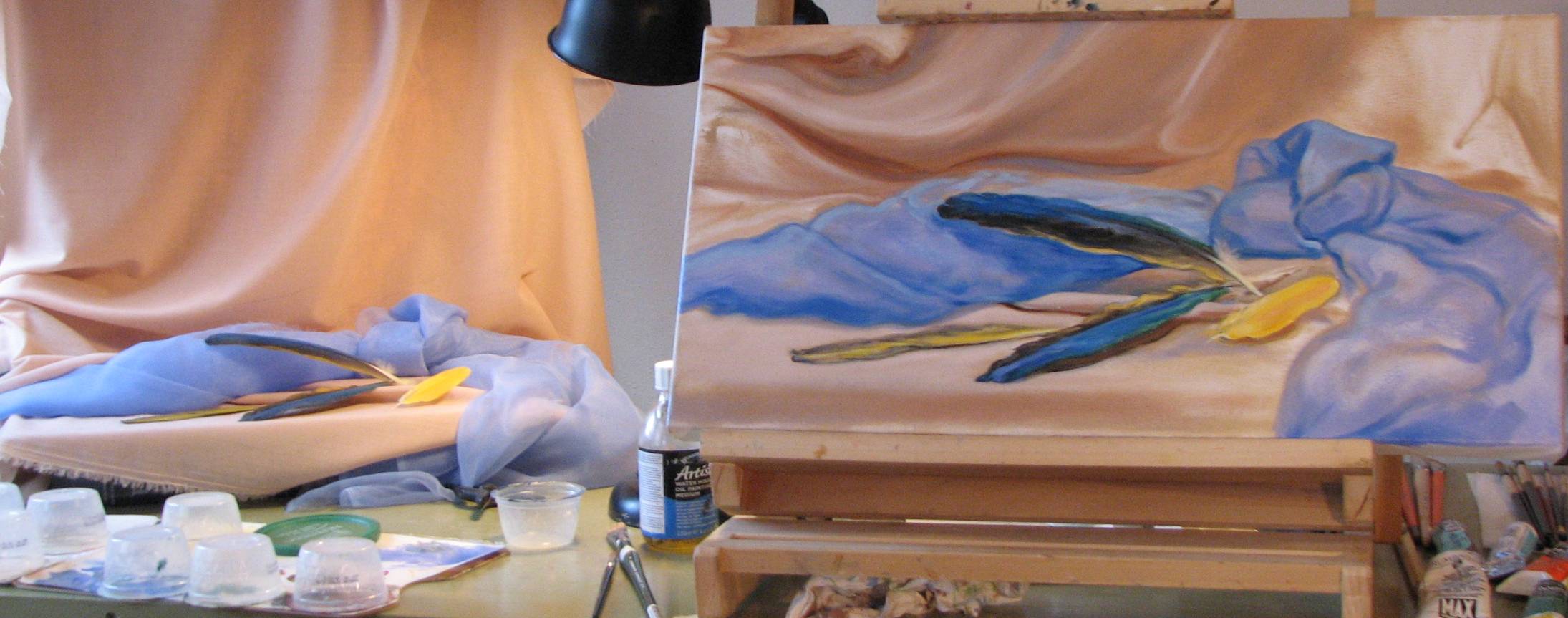
| December 20, 2010. Parrot feathers done!...I think. I'll have to sit with it for a day or so and see if anything jumps out at me. I adjusted the hue of the blue fabric to be a bit more periwinkle because it took too much of a turn into blue-green, particularly in the shadow under the top feather. I also ended up developing more of it than I had thought I would at the start, but sometimes these things go in a direction and seem to want to proceed that way. Seeing a photo of the painting on the computer sometimes assists in detecting aspects of composition and values that I miss when looking at it so long in person, although I don't rely on a photo to evaluate color, since casual photos taken indoors like the ones I take of these paintings in progress are often inconsistent in color. All in all, the fast changing light conditions of winter are harder to deal with than I was aware of, and because of this I found that as I progressed with more of the painting as a whole, I was making a lot of minor adjustments to areas that I thought were settled. |
 |
| December 15, 2010. Disasters, flu and
painting. I missed about 3
consecutive days of painting owing to preparations for the small
works opening, and then a brief bout of intestinal flu, but I
managed a little work on the parrot feather still life that I
have in progress, painting a couple hours yesterday and some
today--until we were called upon this afternoon, as volunteers
with a disaster relief organization, to prepare refreshments for
firefighters battling a wild fire blaze in our area. The
potential for fires, both human related and natural, increase
this time of year with the use of fuel burning and electrical
heating methods, high winds, real Christmas trees, and various
other risk factors. We've dealt with two fire situations
in the past two weeks, and wherever you reside, I urge great
caution regarding the risks for fires. Be careful and be
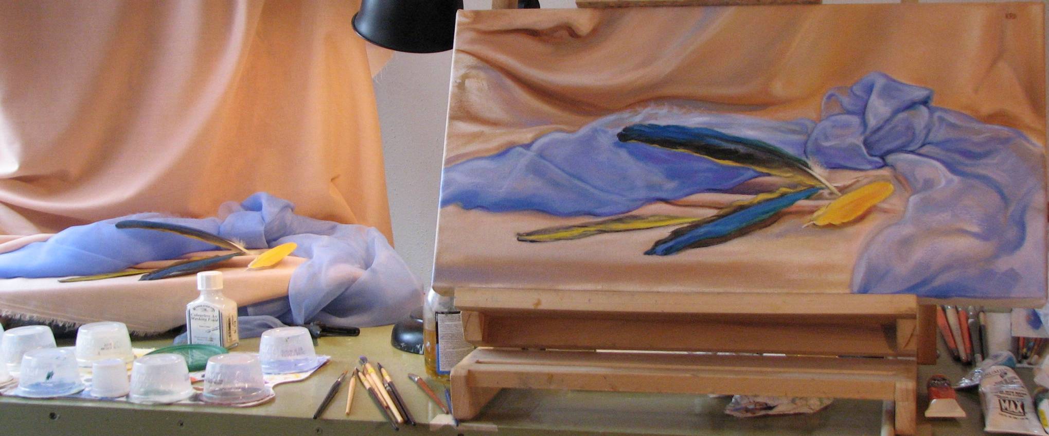
safe! I've been working on the background drapery, trying to retain some of the original gesture of my initial layout, but developing the flow and lines of the fabric. I did some additional work on the feathers, but they'll likely need some recalibrating as the drapery takes shape. The blue fabric still needs a lot of targeted work. |
 |
| December 15, 2010. Art history on PBS. My area's PBS station is showing 'Paris: the Luminous Years' this evening, and even though I'm a representational artist, I'll be watching because I think there's something to be gained from exposure to great art of all time periods, cultures and styles. If you think so too, you may find it airing soon on your local PBS station. |
| December 14, 2010. So what’s wrong with
‘pretty?’ On my still life page I write,
“The objects I use can be and often are 'beautiful' in their
way, but superficial, decorative 'prettiness' is increasingly
not my goal.” So what do I have against pretty? Well…nothing.
There are some very pretty images out there, and like many
people, I do respond to them. That’s fine. What I also respond
to, but at a much deeper and more compelling level, however, is
beauty. Power. Honesty. A little pretty isn’t a bad thing.
It’s a lot like sugar. In moderation it provides some very
appealing flavor and comfort, a quick lift, and that’s of
value. We need some sugar to survive. But a diet continually
high in sugar is definitely not a desirable thing. It can be
addictive, swamping out our appreciation of the full spectrum of
flavors, and with my art as with sugar, I felt the need to wean
myself off of a tendency toward too much pretty. I need to get some
balance. This realization hit me when I saw a reproduction
of Manet's quiet but powerful still life,
'Asparagus' (1880). It's a painting of a single stalk
of white asparagus hanging partly off the edge of a table.
It's just the minimum required to still be considered a still
life, but Manet draws you into the subtle colors and form of
that one stalk of asparagus in a way that painters of other more elaborate
and showy still life compositions fail to do. I see beauty, honesty and power as something more essential, more fundamental than pretty, something a bit different, more profoundly nourishing. Sometimes very close, but still qualitatively different. To illustrate the distinction, consider two paintings by two different masters. The first painting is 'Two Sisters (On The Terrace)' by Renoir. It's a very pretty painting. I liked it so much as a high school student when I first saw it at Chicago's Art Institute that I bought a poster of it. I still really like it. The second painting is 'Hendrickje Bathing in a Stream,' by Rembrandt. Pretty doesn't really apply--it's just somewhere out there light years beyond pretty. It's got it all: beauty, honesty and power. The pretty habit is certainly tenacious, and I can’t go cold turkey, but I’m making an effort to ease off the pretty factor by manageable increments. Will beauty, honesty and power follow? Time will tell. |
| December 11, 2010. Questioning the value of ‘inspiration.’ When I began this blog I decided I was going to do less of the the kind of ‘cheer leader’ motivational topics that one reads in many other art blogs—when there are other art issues that don't get needed attention, why cover a lot of ground that is dealt with elsewhere, and likely done better than I could do? If I give in and address a motivational topic it's because I think it's really worth addressing. I was thinking about some of the comments made by established artists Chuck Close and Richard Serra in the Charlie Rose panel discussion I blogged about below (Nov, 24, 2010, 'Hoops & Hurdles). I’ll roughly paraphrase a comment made by one of the artists regarding ‘inspiration:’ “Inspiration is for amateurs; the rest of us just go to work.” It sounded kind of blunt, but once I got past the initial prickliness of it and allowed myself to think about what they were saying, I began to understand: art is the result of deliberate, disciplined effort conducted on a sustained basis. It is the product of self-directed labor. Artists who passively wait for ‘inspiration’ to strike before acting are not in control of their art. Take control. |
| December 10, 2010. Work on focal objects. With the opening reception for the Tiny Treasures small works invitational to prepare for, I didn't get a lot of painting in today. During the time I did have, however, I was able to start focusing in on the objects at the center of interest: the parrot feathers. I can give these kinds of small areas attention when I have to split my time between painting and other tasks and projects. As with the leaf in 'Agua Frio' below, it is critical to the end success of this composition to get the attitude of the feathers absolutely right. The color gradations within the feathers are also important, but they really contribute to the overall arc and trajectory of the forms. |
 |
| December 9, 2010. Blocking in, continued. As can be seen, I'm starting to set the local colors of the objects. The texture of this gallery wrap canvas is slightly different from the standard canvases I've been using in that the surface is a bit more slippery or oily. It helps keep things loose at this stage. Feathers are always fun to paint, and these brightly colored parrot feathers are especially so. I initially thought I'd be using the peachy pink blossoms from a small variety of potted rose bush I have in my studio, but paired with the sheer blue fabric it all just looked too 'fru-fru.' My friend brought me the parrot feathers just in time for this painting, and I think they add a little more sophistication to this particular composition than the roses offered. There will be a time when I find a satisfactory way to paint the roses, but this wasn't it. |
 |
| December 9, 2010. Drywall mud and parrot feathers. My husband and I have been working for several weeks on the showroom, so I took some time today to sand drywall mud, one of my favorite home improvement jobs--NOT! Once done with that I was able to set up a new still life, this time a horizontal format, gallery wrap canvas. A friend gave me some blue and yellow parrot feathers, so I wanted to incorporate those into this new composition. I was able to roughly lay in the shapes before the sun dropped too low in the sky--I'm looking forward to December 21 when the days start to lengthen ever so slightly again. This canvas looks like a lot of chaos now, but there's a raw energy to this stage that I am really going to try to retain in some way as this one progresses. |
 |
| December 8, 2010. 'Agua Frio' finished! |
 |
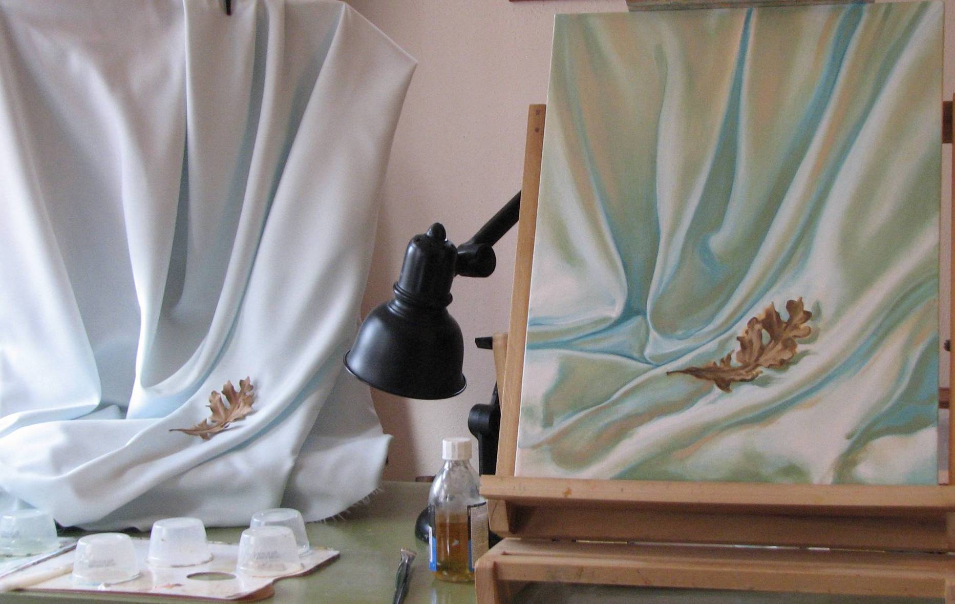
With art defined as language, there should be no more, um, conflict between advocates of traditional art forms on the one hand, and modern to post-modern forms of art on the other. It’s all language, folks, and if it’s being ‘spoken’ then it’s viable and legitimate. Art as language would allow for and encompass the existence of a diversity of art ‘linguistic families’ and ‘dialects.’ There is a cultural component to human language--we first learn the
language(s) of the culture into which we are born and/or raised at the time we make our first utterances--but we share a universal process of language acquistion, and humans do have the capacity to learn multiple languages. Likewise, humans have the capacity to engage in multiple expressions or forms of art. Speak the art language that best communicates what you want to communicate.
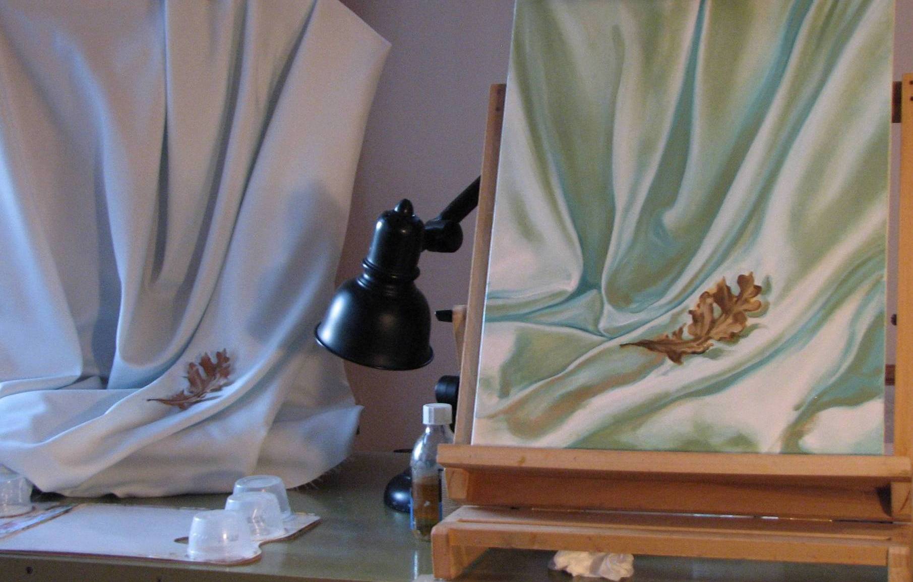
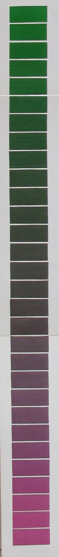
In the 'grays' chart color theory assignment to the right, I mixed two roughly complimentary colors (green and a fuschia red) by small increments. As can be seen, there is a wide range of 'colored' grays between the two pure end samples, with the most neutral grays in roughly the middle of the sequence. This sequence demonstrates how you can get interesting shadows without ever using literal black.
In the still life I'm currently working on--which involves a lot of subtle variation--I am beginning to modify the chroma, values and temperature of the forms with some warmly colored shadows. The bottom image is the previous day's work involving mostly local color, while the top image is today's work on bringing in the colored shadows. Additional areas have shadows that are redder, and some that are noticably cooler, so I'll address those shadows next, and eventually glaze over some of it so that most of these colored shadows are somewhat subtler. (I haven't yet dealt with the leaf, which is still in the very beginning layout stage--that's for another post.)
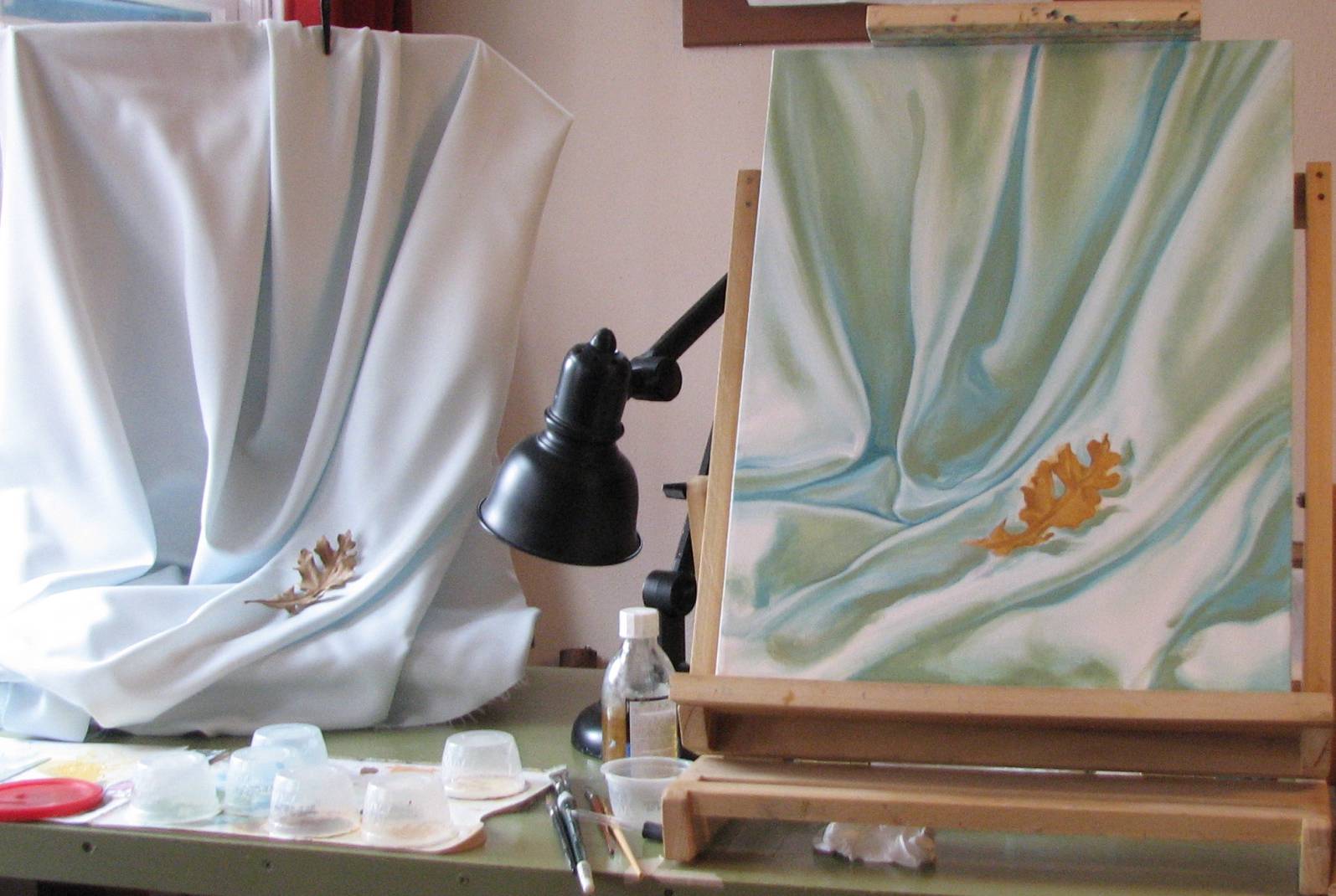
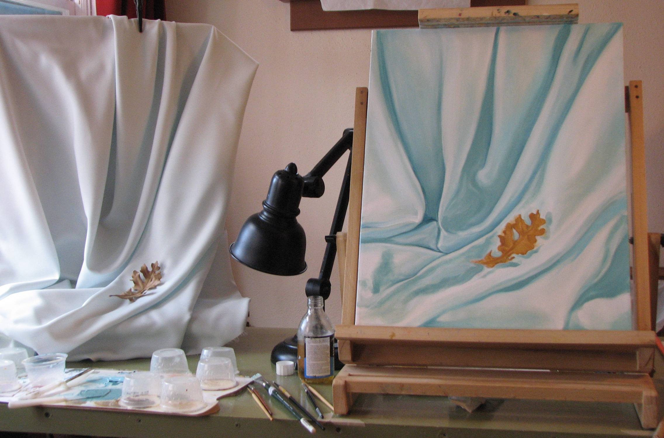
On a more regular basis, however, are the weekly gallery print talks we attend at the university. There is a vibrant printmaking program at Highlands which draws many talented and energetic students. The gallery print talks are given by a local collector--a collector in the truest sense of the word--with a lifelong passion for prints and an impressive and comprehensive knowledge of printmaking that he generously shares with students and interested members of the community. How cool is that?! We live in a fairly small city, and the nearest major population center is about 80 miles in any direction, so we really appreciate the local art resources like Highlands University. University art departments are getting hit with a lot of criticism these days, but we've found that ours provides a variety of valuable resources to the community and to artists in particular. Be sure to fully investigate your local university or college art department before dismissing it as having nothing to offer representational artists.
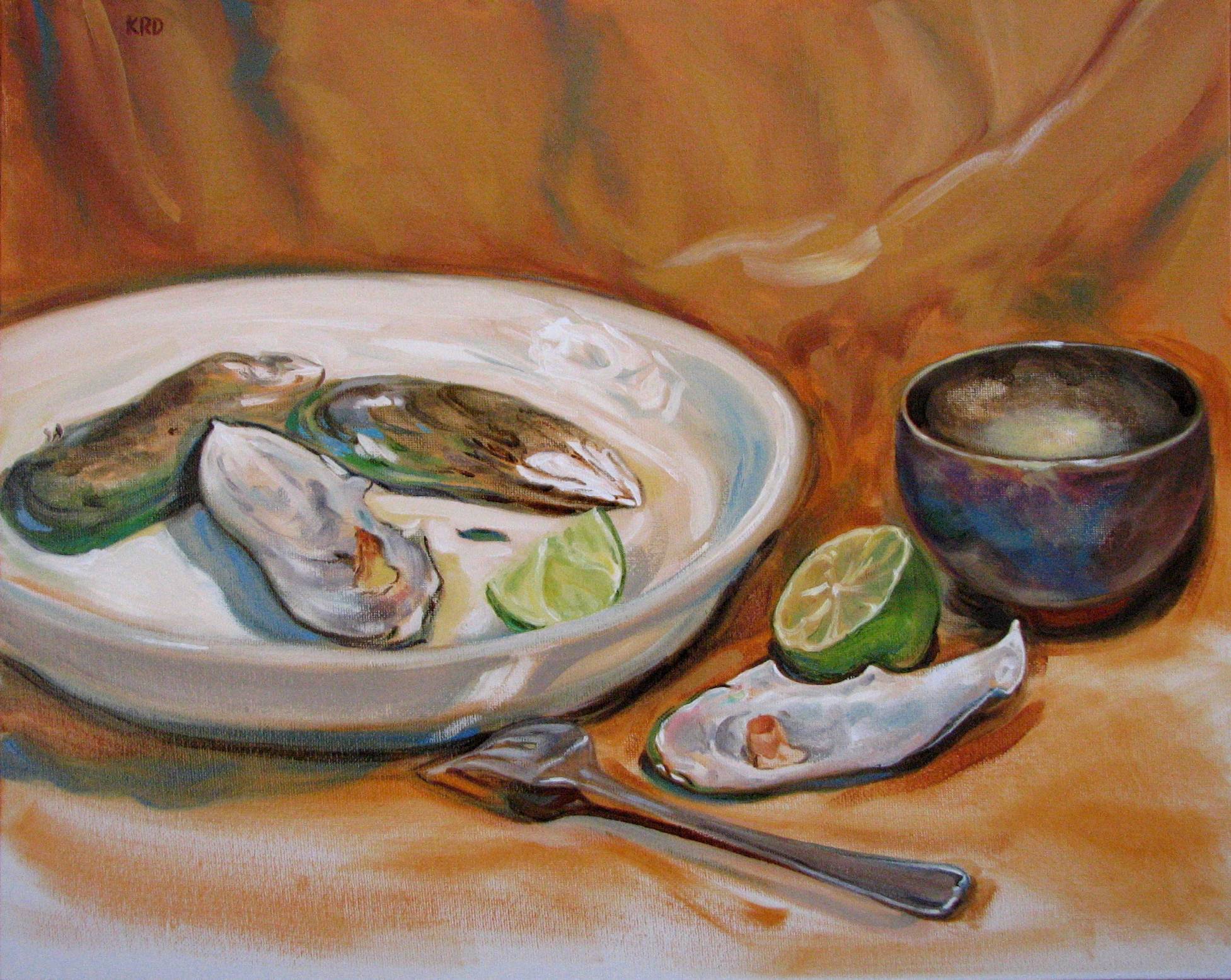
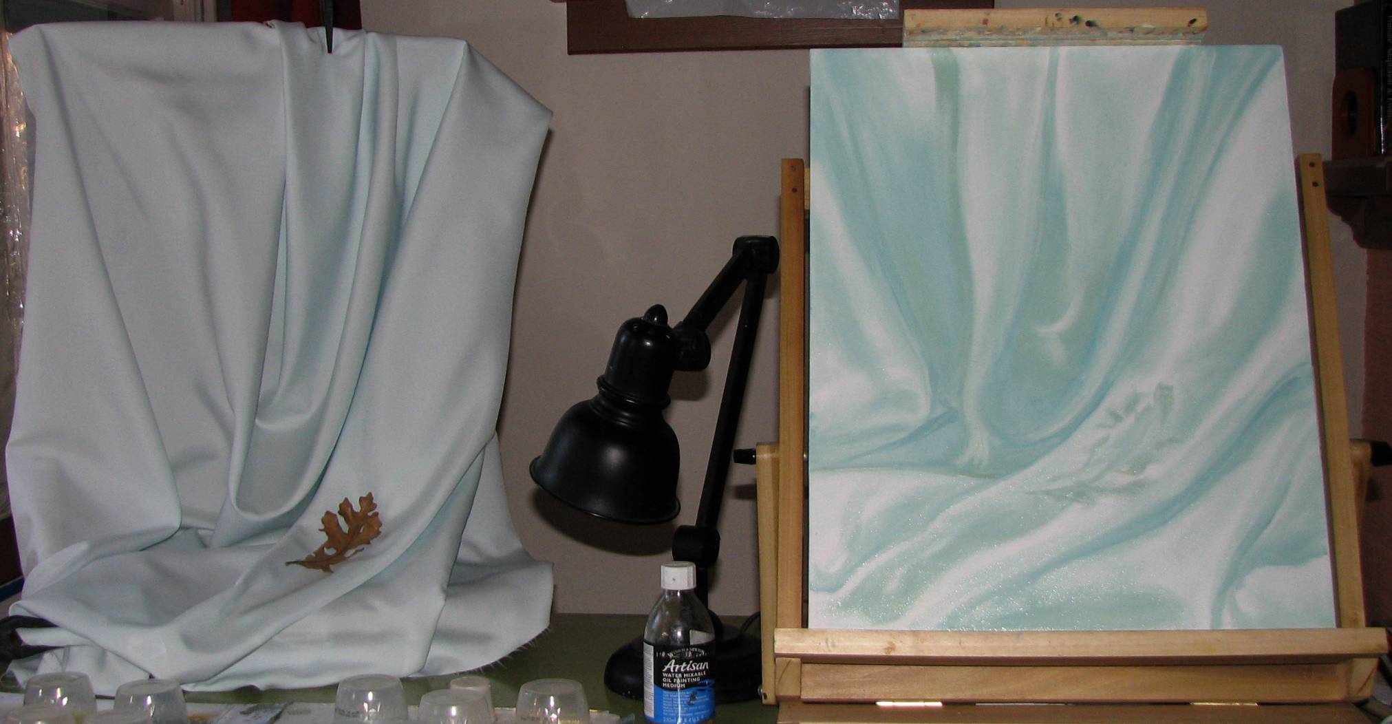
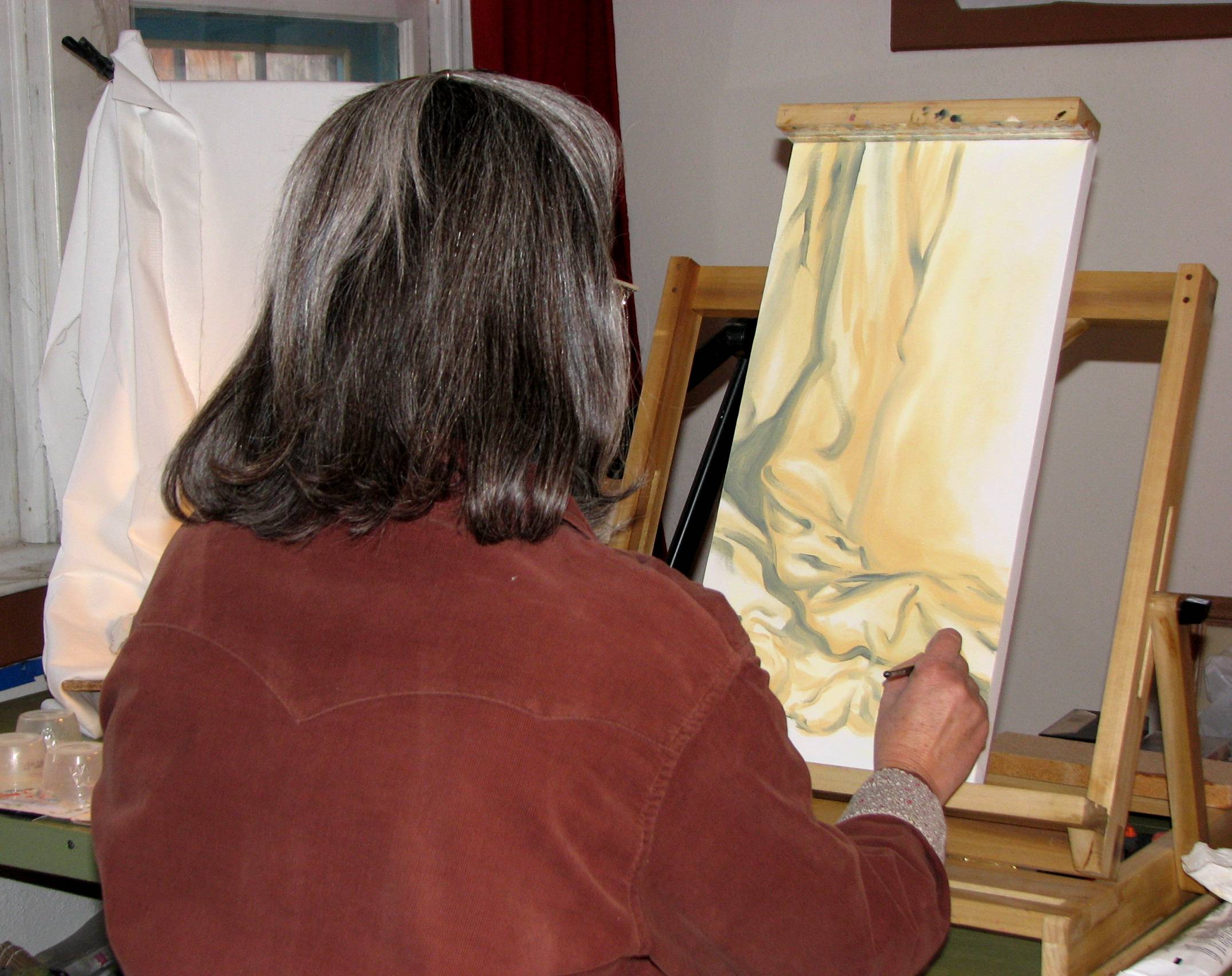
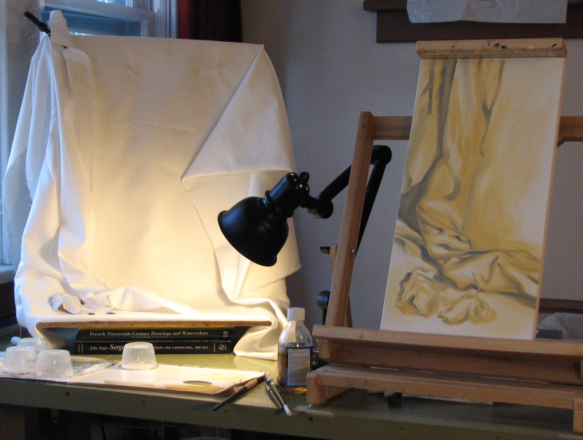
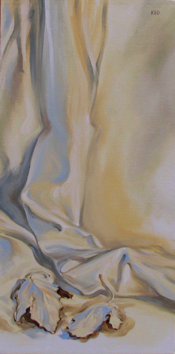
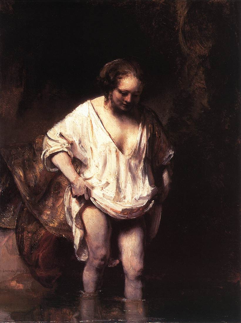